Section outline
-

In this training course, you will learn how to train an artificial intelligence model to detect objects of your choice within your images. Object detection is a technology within the field of Computer Vision that enables computer systems to identify and locate specific elements within images. Unlike simpler image classification tasks, which assign a single label to an entire image, object detection offers a granular understanding by simultaneously predicting an object's class (e.g., "person," "car," "dog") and its spatial location within the image.
To go through this course, you will need a computer and an internet connexion.
It is important to note that training an artificial intelligence model is energy-intensive. Numerous pre-trained models for object detection already exist, such as those available on the Ultralytics platform or the Hugging Face platform, where models can be retrieved free of charge as they are open source. However, in specific contexts where existing solutions are insufficient, the development and training of a custom model remain necessary.
-
-
This tutorial outlines the methodologies pertaining to object detection and recognition within images. It details the training protocols for artificial intelligence models to ensure the identification of specific targets and their precise spatial localization through the use of bounding boxes.
A model trained to recognize fractures will yield the following result :

(Source : https://doi.org/10.1259/bjr.20200975)
So we will have a tool that is not only capable of locating something spatially but also of recognizing it.
SUPERVISED MODEL TRAINING
Training an artificial intelligence model for object detection relies on supervised learning. This approach requires submitting previously annotated images to the model, where subjects of interest have been delimited by human intervention, thereby providing the "ground truth" essential for the autonomous learning of object features.
The creation of these reference datasets necessitates a manual annotation phase, consisting of framing target objects with rectangles. Although laborious, this step is imperative. While annotated databases exist, their availability remains limited for niche domains, often rendering the creation of custom datasets necessary.
The model utilized in this context is the "YOLO" architecture, the technical specifics of which will be detailed later.
CONCEPT OF CLASS
Subjects of interest must be associated with a label designating their category of belonging, termed a "class." This taxonomy offers total flexibility: it can be general (e.g., "cat," "dog") or highly specific (e.g., "Australian Shepherd," "Weimaraner"), depending on the detection objectives.
The term "class," recurring throughout this document, refers exclusively to the object categories targeted by the model.
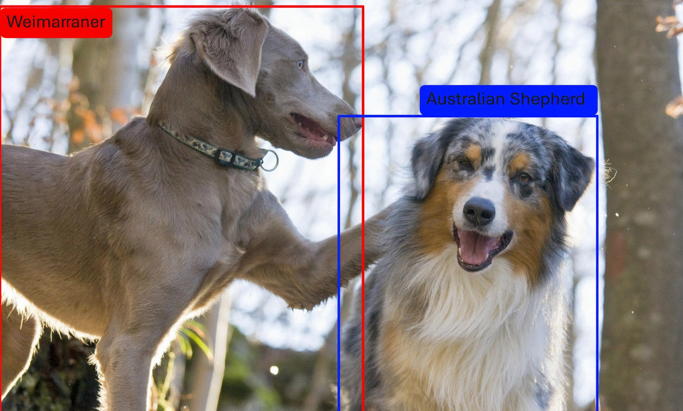

DIVERSITY OF DATA
It is important to note that the efficacy of a trained model is intrinsically linked to the representativeness of its training data. For instance, a model specialized in detecting cats in snowy environments might fail to identify these same animals in a different context, such as a meadow. Consequently, the construction of the dataset must faithfully reflect the diversity of the deployment scenarios envisaged to ensure the system's robustness.

-
-
-
Several free annotation tools exist, such as CVAT, Label Studio, or Roboflow; the latter will be prioritized and detailed here. The procedure begins with creating an account on the Roboflow platform, followed by initializing a new object detection project via the standard tool. After importing the images, annotation is performed using the "Bounding Box Tool," accessible from the sidebar.
Each object must be precisely delimited and associated with its respective class. This iterative process continues until the dataset is exhaustively annotated. Once this step is validated, it is necessary to generate a "version" of the annotations to export them in a format compatible with the YOLO architecture.
This versioning phase integrates two types of data processing: preprocessing and data augmentation. Let us examine the specifics and purpose of these two operations.
We must now address some explanatory concepts before proceeding. There are two types of data modification: preprocessing and augmentation. We will briefly overview the utility and nuances of each stage.
PREPROCESSING
Preprocessing consists of applying uniform transformations to the entire annotated dataset. Let x represent the initial number of images; this operation preserves the cardinality of the set (x images before and after) but substitutes the original files with their transformed versions, resulting in the irreversible loss of raw data. The primary objective is the homogenization of the dataset.
Common transformations include:
- Resizing : Ensures uniform dimensions across the entire dataset.
- Grayscale conversion : Eliminates chromatic information when it is irrelevant, thereby optimizing storage space and the required computational power. This operation is exclusive: original color images are definitively replaced.
- Artifact removal : Applies digital filters to eliminate noise or other undesirable visual perturbations.
AUGMENTATION
Although data diversity is crucial, collecting images under varied conditions often proves complex. Data augmentation addresses this constraint by artificially generating new images from existing samples through the application of digital transformations. This technique enables the enrichment and diversification of the training dataset. By submitting variants of the same image to the model (e.g., in grayscale or inverted), one improves its robustness and generalization capacity, allowing it to recognize objects regardless of their orientation or chromatic properties.
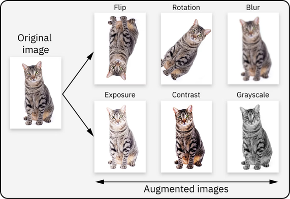
Data augmentation differs from preprocessing in its multiplicative effect on the dataset volume. If x represents the number of initial images and six transformations are applied, the final set will comprise 7x images (x originals plus 6x generated).
Unlike preprocessing, which substitutes raw data, augmentation complements it by retaining the originals. For instance, adding a grayscale conversion during this phase doubles the dataset: the model is thus trained simultaneously on color versions and grayscale versions, maximizing example diversity without loss of initial information.
HOW TO CHOOSE THE ANNOTATION SUPPORT ?
Preprocessing and augmentation can be performed either upstream (via Roboflow) or dynamically (via YOLOv8). The former method, while storage-intensive, accelerates training through the prior generation of data. The latter, space-efficient, increases the computational load by creating variations on the fly.
The strategic choice depends on hardware resources: prioritize dynamic generation (YOLOv8) on powerful infrastructures, and the upstream approach (Roboflow) on limited machines, thereby disabling YOLOv8's default augmentations to avoid distortions.
Once the preprocessing and augmentation transformations have been applied, define the desired number of images in the "5 - Create" section, then validate the version generation.
Next, download this version by selecting the "YOLOv8" format and the `.zip` archive. Finally, extract the contents of this archive directly into your working directory.
-
-
The implementation of an object detection system requires the use of an artificial intelligence model, a complex neural architecture whose design *ex nihilo* is reserved for experts. The standard approach therefore consists of leveraging pre-existing models developed by professionals, focusing exclusively on the training phase of the neural parameters.
In this context, we will utilize the YOLO (You Only Look Once) architecture, developed by the company Ultralytics. Although several iterations have been published over time, this tutorial is based on the most recent available version, termed YOLOv8.
The implementation of this project first requires the configuration of a Python virtual environment. Conceptually, this isolated space functions as an autonomous unit within a host system: it guarantees the independence of software dependencies and configurations, thereby avoiding potential conflicts with other applications or with the operating system itself.
This isolation allows code to be executed in a controlled and reproducible context, akin to a virtual "mini-computer," thus ensuring the stability and portability of the project without altering the global environment of the physical machine.
INSTALLATION OF UV
The creation of this virtual environment relies on the "uv" tool, which acts as the architect and builder responsible for designing and deploying these isolated spaces.
The installation procedure for "uv" varies depending on the operating system. Please refer to the video guides below.
For Windows :
For Linux/macOS :
SETTING UP THE VIRTUAL ENVIRONMENT
Now the tool for creating a virtual environment is installed (the architect and construction team have arrived). We now need to design the “floor plan” of our environment by specifying everything we need. This is exactly what we will do in a .toml file, which we will create together.
In this file, we will specify that we need Python and the Ultralytics package.
Start by opening a text editor (for example Notepad on Windows).
Then, in a blank file, copy and paste the following lines:
[project]name = "your_project_name"version = "0.1.0"description = "Add your description here"readme = "README.md"requires-python = ">=3.12"dependencies = [ "ultralytics>=8.4.18", ]Then click “Save As”:
-
Go to your working directory (the folder where you extracted your Roboflow .zip archive)
-
In “Save as type”, select “All files (.)”
-
In “File name”, enter pyproject.toml (this name must be exact and cannot be changed)
-
Finally, save the file.
Important point: make sure that “.toml” is indeed the file extension. To do this, you first need to display file extensions:
Go to View → Show (at the bottom) → File name extensions, then check that the file name ends with “.toml”.
PYTHON CODE
Now, create a Python file in the same folder, using the same method as before:
-
Open a text editor
-
Write the three lines below (you can copy-paste them)
-
Click “Save As”
-
Set the extension to .py (same process as before, but instead of .toml, use .py)
The lines in question:
from ultralytics import YOLOmodel = YOLO(“yolo26n.pt”)results = model.train(data=”data.yaml”, epochs=100, imgsz=640)EXPLANATIONS
-
-
model = YOLO(“yolo26n.pt”)
-
This line is used to specify which model you want to train. In this case, we can see that a “nano” model is being used because there is an “n” after “yolov26”. YOLO provides five model sizes: nano (“n”), small (“s”), medium (“m”), large (“l”), and extra-large (“x”). Intuitively, smaller models are faster but less accurate, while larger models require more computation time but are more robust and powerful.
These models are pre-trained to save both training time and to improve performance.
(For advanced AI users, YOLO also allows you to build your own neural network by manually defining each layer in a .yaml file — see the official documentation)
-
-
results = model.train(data=”data.yaml”, epochs=100, imgsz=640)
-
- data: set this to the name of your
.yamlfile provided in the Roboflow.zipexport. - epochs: epochs correspond to the number of training cycles. To put it simply, the model goes through all images in the training set and updates its parameters. The number of epochs defines how many times it will iterate over the entire dataset.
- imgsz: this refers to the size of your images, so you should use the same value you selected in Roboflow. The default value is 640, so if you want larger or smaller images, you must explicitly specify it; otherwise, images will be resized (downscaled or upscaled) automatically.
To give you some typical parameter benchmarks:
- model:
yolo26n.pt(Nano version for speed) oryolo26s.pt(Small version for accuracy). - epochs: 100 is the default value. For small datasets, you can increase it to 300.
- imgsz: 640 is the default value. Use 320 for faster processing or 1280 to detect very small objects.
- batch: -1 for automatic adjustment based on your VRAM, or 16 by default.
- device: 0 to use your first GPU, or
cpuif you don’t have one.
Regarding model size, it is recommended to switch to a larger model than
yolo26s(such as the m, l, or x versions) in the following situations:- Need for maximum accuracy: If your current model suffers from underfitting and fails to capture complex details, a larger model offers greater learning capacity.
- Dataset complexity: For large datasets (> 50,000 images) with many classes or dense scenes, Medium or Large models perform better.
- Difficult objects: If you are working with high-resolution images containing very small objects (such as aerial or medical imaging), the increased capacity helps reduce detection errors.
- Sufficient hardware resources: Use a larger model if deployment is on a server (such as the ISDM MESO cluster) or a powerful GPU rather than on mobile or CPU.
AUGMENTATION
We have now reached the point where you may need to disable YOLO augmentation, if necessary.
If you have already performed augmentation with Roboflow and do not want YOLO’s augmentation to interfere, add the blue-highlighted lines below.
Make sure to keep your initial parameters such as data, epochs, imgsz, etc :
model.train(
data="data.yaml",
epochs=100,
imgsz=640,
hsv_h=0.0, # Disable color (Hue)
hsv_s=0.0, # Disable color (Saturation)
hsv_v=0.0, # Disable color (Value)
degrees=0.0, # Disable rotation
translate=0.0, # Disable translation
scale=0.0, # Disable scaling
shear=0.0, # Disable shear
perspective=0.0, # Disable perspective
flipud=0.0, # Disable vertical flip
fliplr=0.0, # Disable horizontal flip
mosaic=0.0, # Disable mosaic
mixup=0.0, # Disable mixup
copy_paste=0.0, # Disable copy-paste
auto_augment=None, # Disable auto-augment policies
erasing=0.0 # Disable random erasing
)
Otherwise, if you have not performed any augmentation with Roboflow, the simplest approach is to let YOLO handle augmentation by default. In that case, do not include any of the blue lines above, as we want these parameters to keep their default values.
FINAL STEP CHECK
Your working folder should look like this by the time you've arrived here :
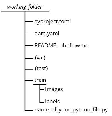
Note: there may be variations in the train, val, and test files depending on how you organized your dataset. The most important point is that the
data.yamlfile remains consistent with the corresponding paths.RUN THE CODE
Everything should now be ready, so you can run the code. To do this:
-
Go to your working directory
-
Right-click and open a terminal in that folder
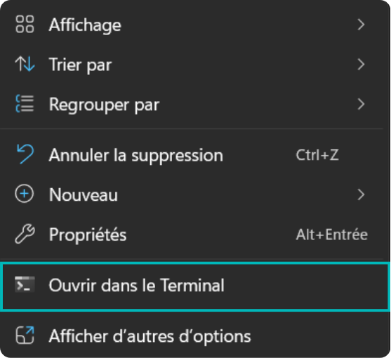
On macOS, access the working directory via the `cd` command followed by the absolute path in the terminal. Then, launch the script execution with the command `uv run name_of_your_python_file.py`.
The initial execution of this command requires significant processing time, as the `uv` tool must interpret the `pyproject.toml` configuration file and provision the virtual environment with all required dependencies (Python, Ultralytics, etc.). Once this environment is built, subsequent executions will launch considerably faster.
Upon completion of the training, a model performance evaluation phase is essential. The following section, "Results," details the interpretation of the metrics calculated by YOLO. For a summary analysis of the model's quality without entering into technical details, you may refer directly to the "Conclusion" subsection of this same chapter.
-
-
-
-
Upon completion of training, the results are stored in the `runs/detect/train` directory, unless a custom path has been configured. This folder contains all the artifacts necessary for evaluating the model's performance and for its subsequent deployment.
Although this section details the complete interpretation of the generated data, a summary analysis of the success criteria is available directly in the conclusion of this chapter. The directory tree generally includes the following elements (subject to slight variations depending on the configuration):
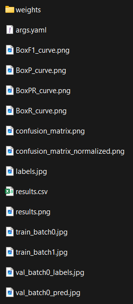 We will go through what each element represents one by one.
-
-
-
The “Weights” folder corresponds to the result of your work, as it contains the weights of your model. It is essentially your model stored in a file.
There are two files inside: “best.pt” and “last.pt”. This can be understood as follows: the weights of the neurons change continuously during training, and the quality of these weights is evaluated using a specific function. Therefore, last.pt corresponds to the most recent weights, while best.pt corresponds to the best weights obtained throughout the entire training process. We will discuss later why having two files can be useful.

-
-
-
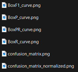
In computer vision, the “confusion matrix” is widely used, and it allows us to derive many relevant statistics to evaluate a model.
We need to go through a theoretical section before fully understanding what we are seeing, so you may need to focus a bit!
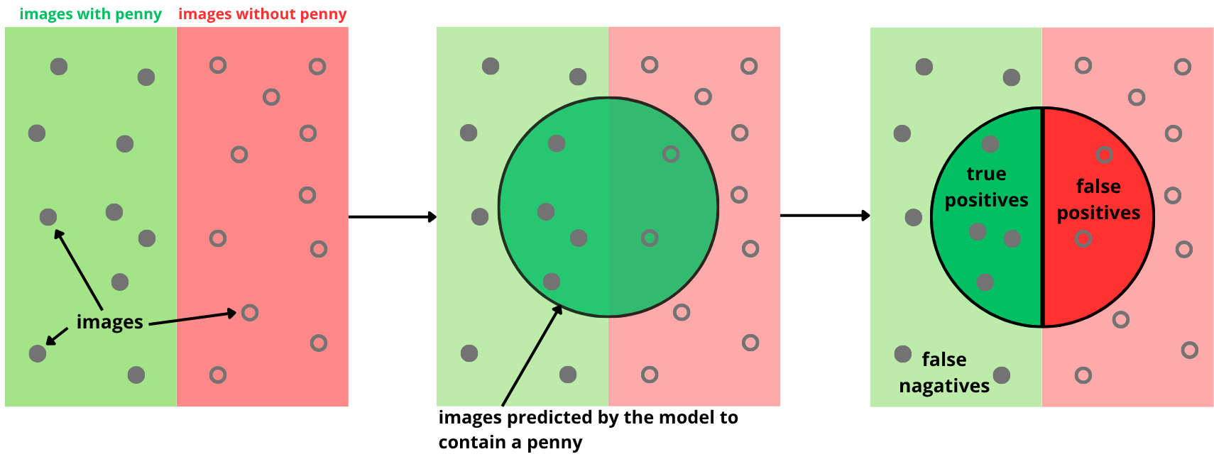
For this theoretical part, we will consider the case where we are trying to detect British coins called “pennies”.
CONFUSION MATRIX
A confusion matrix is a table that synthesizes and categorizes the model's predictions to facilitate their analysis.
Here, a distinction must be made between what is true and what was predicted. An object belongs to a specific class; this is referred to as the "ground truth" (e.g., a cat belongs to the "cat" class). Conversely, the model makes predictions by assigning a class to an object. However, the model can err; its prediction does not necessarily correspond to reality (for instance, a cat might be classified as a "dog").
Therefore, we distinguish between:
- ground truth : the actual class of the objects.
- predictions : the results generated by the model.
Within each of these two categories, there are two possible outcomes : positive (presence of the target object, e.g., a penny) and negative (absence of the target object).
This creates four possible combinations:
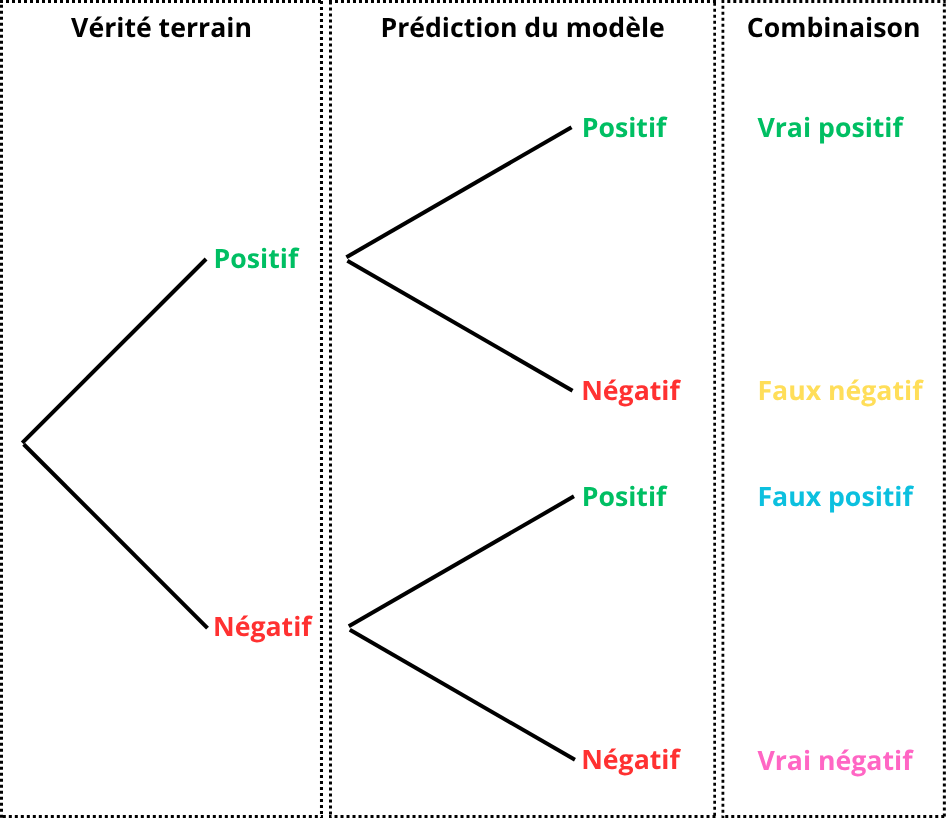
For easier interpretation, these four combinations are consolidated into a two-way table. The rows correspond to the model's predictions, while the columns represent the ground truth.
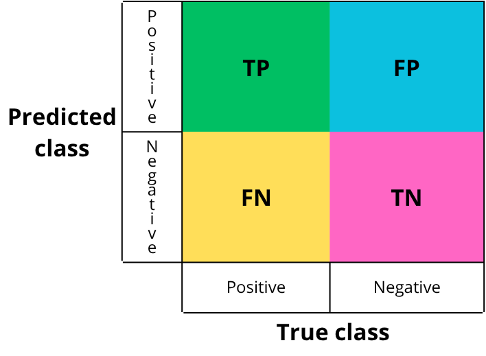
- TP: True Positive
- What should be detected and is correctly detected.
- Example: a “penny” is present and correctly detected.
- TN: True Negative
- What should not be detected and is not detected.
- Example: no “penny” is present and none is detected.
- FP: False Positive
- What should be negative but is predicted as positive.
- Example: no “penny” is present but one is detected.
- FN: False Negative
- What should be positive but is predicted as negative.
- Example: a “penny” is present but not detected.
EXAMPLE
The image below corresponds to the ground truth, i.e., the manually annotated data that the model is expected to detect:
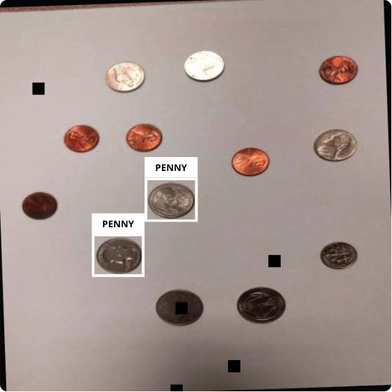
The next image corresponds to the detections made by the model on the same image after training:
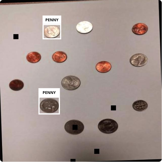
If we compare the two images:

We then fill in the confusion matrix with each instance:
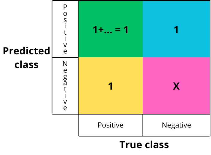
Each cell is filled by counting the number of occurrences of each event. In this simplified example, there is one of each. True negatives are not counted in detection tasks, as they are not meaningful: saying that nothing was detected when nothing was present becomes noise at the image scale.
From this matrix, we can derive several metrics to evaluate the model. Ultralytics provides four curves: precision-confidence, recall-confidence, precision-recall, and F1 score. We will see how to interpret them, but first let’s define each concept.
CONFIDENCE
When the model makes a prediction, it outputs a value representing the certainty of the prediction, i.e., a probability. This value, between 0 and 1, is called confidence (1 meaning absolute certainty).
A threshold value must be chosen. If the confidence is above this threshold, the detection is accepted (labeled “penny”); otherwise, it is rejected (labeled “background”/negative).
EXAMPLE
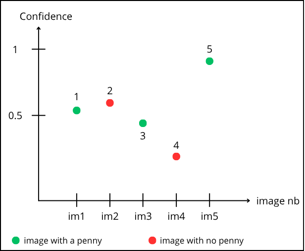
Reading the graph: point “1” corresponds to prediction on image 1. It is green, so a “penny” is present. The model predicts it with a confidence of 0.55.
Point “2” corresponds to image 2. It is red (no “penny”), but the model predicts a “penny” with 0.6 confidence.
Let’s choose a threshold of 0.5. Points above are accepted, below are rejected :
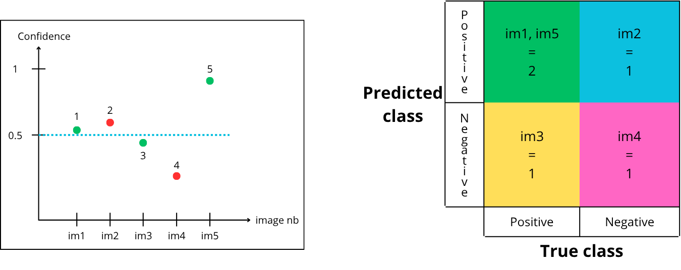
How to fill the matrix :
-
Point “1” is above the confidence threshold, so it is predicted positive (contains a penny) and is green (actually contains a penny) → True Positive
-
Point “2” is above the confidence threshold, so it is predicted positive (contains a penny) and is red (does not contain a penny) → False Positive
-
Point “3” is below the confidence threshold, so it is predicted negative (does not contain a penny) and is green (actually contains a penny) → False Negative
-
Point “4” is below the confidence threshold, so it is predicted negative (does not contain a penny) and is red (does not contain a penny) → True Negative
-
Point “5” is above the confidence threshold, so it is predicted positive (contains a penny) and is green (actually contains a penny) → True Positive
Now let’s try a threshold of 0.75 :
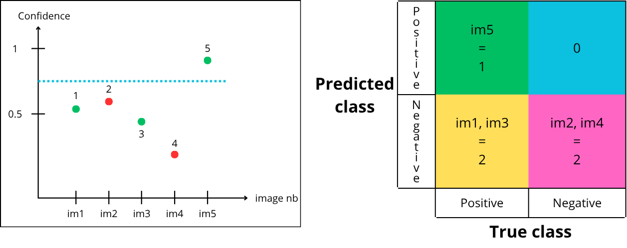
-
Point “1” is below the threshold, so it is predicted negative but green → False Negative
-
Point “2” is below the threshold, so it is predicted negative and red → True Negative
-
Point “3” is below the threshold, so it is predicted negative but green → False Negative
-
Point “4” is below the threshold, so it is predicted negative and red → True Negative
-
Point “5” is above the threshold, so it is predicted positive and green → True Positive
Finally, let’s try a threshold of 0.35 :
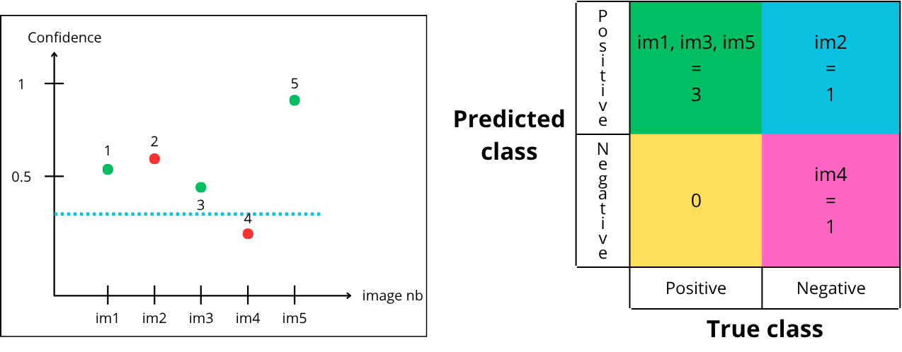
- Point “1” is above the threshold, so it is predicted positive and is green → True Positive
- Point “2” is above the threshold, so it is predicted positive but is red → False Positive
- Point “3” is above the threshold, so it is predicted positive and is green → True Positive
- Point “4” is below the threshold, so it is predicted negative and is red → True Negative
- Point “5” is above the threshold, so it is predicted positive and is green → True Positive
For a given model, there are multiple possible confusion matrices, depending on the chosen confidence threshold :
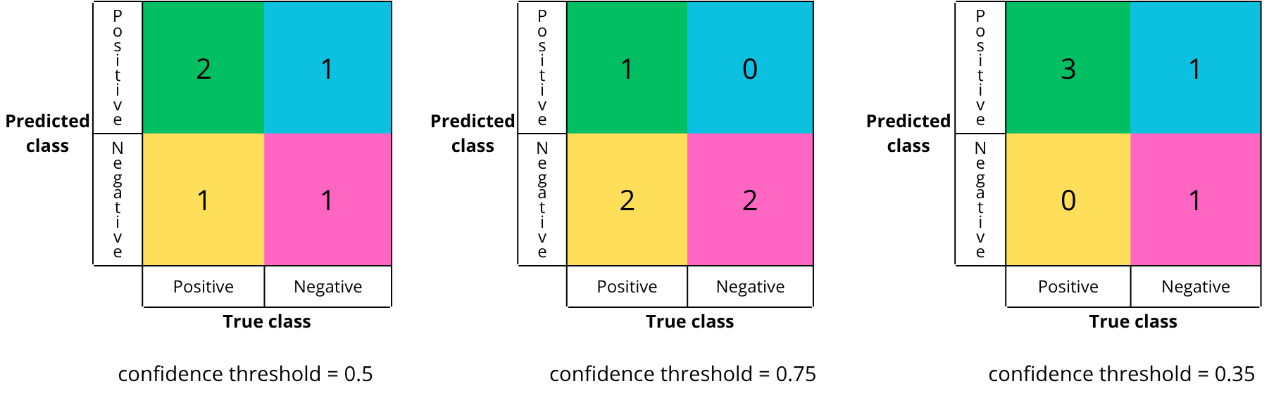
In theory, there are an infinite number of confusion matrices, as there are an infinite number of threshold values between 0 and 1.
The confusion matrix reflects the quality of the chosen confidence threshold. One key objective after training is to select the best threshold for deployment.
But how to know if a confusion matrix is a good one. A good matrix maximizes the correct diagonal (true positives and true negatives) and minimizes the bad diagonal (false positives and falses negatives).
However, in practice, reducing both errors simultaneously is difficult, so trade-offs must be made. For example, in medicine, false negatives are minimized (to avoid missing a disease), even if it increases false positives.
To determine the best threshold, we rely on evaluation metrics which we gonna see in the next section.
-
-
-
Let’s visualize these metrics using a diagram:
Using the previous diagram, we can express precision and recall as follows:
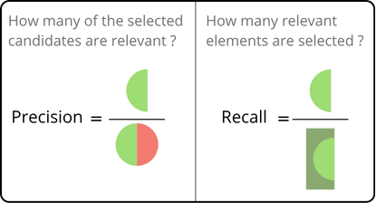
Mathematically, this can be formalized as follows:


It is therefore possible to plot curves to observe how these metrics evolve as a function of the confidence threshold.
PRECISION-CONFIDENCE
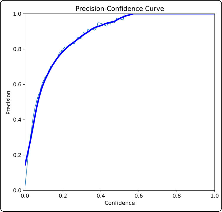
How is it constructed? For all confidence thresholds between 0 and 1:
- compute the confusion matrix for that threshold
- compute the precision associated with this specific matrix
- plot the point on the graph
How should it be interpreted? For example, at a confidence threshold of 0.4, the precision is around 0.92. This indicates that at this threshold, there are relatively few false positives.
Key takeaway: the higher the curve, the better the model.
FURTHER INSIGHTS
This curve must be interpreted carefully because it does not account for false negatives. Moreover, as the threshold increases, fewer predictions are considered, so the increase in precision can be somewhat “artificial”.
This happens because the model becomes very selective. For example, if it only detects one true positive with 98% confidence, it will achieve 100% precision, even though many true positives (below the threshold) are missed.
RECALL-CONFIDENCE
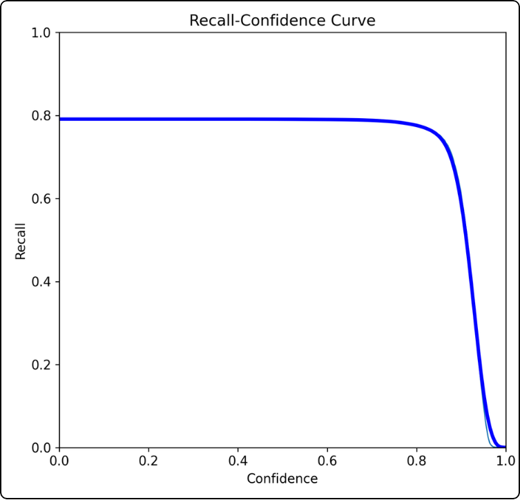
How is it constructed? For all confidence thresholds between 0 and 1:
- compute the confusion matrix for that threshold
- compute the recall associated with this specific matrix
- plot the point on the graph
How should it be interpreted? For example, at a confidence threshold of 0.8, the recall is around 0.78. This indicates that at this threshold, there are many false negatives.
Key takeaway: the higher the curve and the longer it takes to drop, the better the model.
FURTHER INSIGHTS
The curve will inevitably reach 0 because as the confidence threshold increases, the model becomes stricter and accepts fewer predictions. This leads to a sharp increase in false negatives, which drives the recall down.
Precision and recall are both useful metrics but they are complementary. To properly evaluate a model, both must be considered together, especially how one evolves relative to the other.
To avoid constantly switching between the two graphs, combined metrics are used. We will therefore introduce the precision–recall curve and the F1-score in the next section.
-
-
-
The precision-recall curve shows the simultaneous evolution of precision and recall depending on the confidence threshold. It is built in a very specific way, which we will explain just after.
The F1-score is the harmonic mean of precision and recall. This curve is used to find the optimal confidence threshold for deploying your model.
PRECISION-RECALL
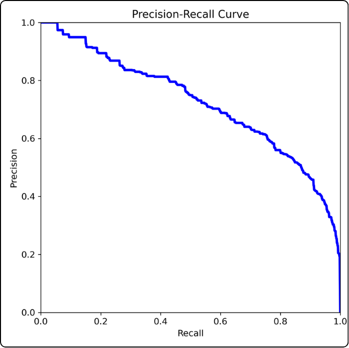
How to build it? This curve is constructed point by point because a third dimension is hidden: the confidence threshold.
We start with the leftmost point: this point corresponds to the precision and recall values when the confidence threshold is 1.
Then we plot the next point to the right: we take a threshold of 0.99 and compute precision and recall from the confusion matrix. And so on.
How to read it? For example, consider the point where the confidence threshold is 0.5 (if you stretch the curve between your fingers, this would be the middle). At this threshold, we can read a precision of about 0.65 and a recall of about 0.67.
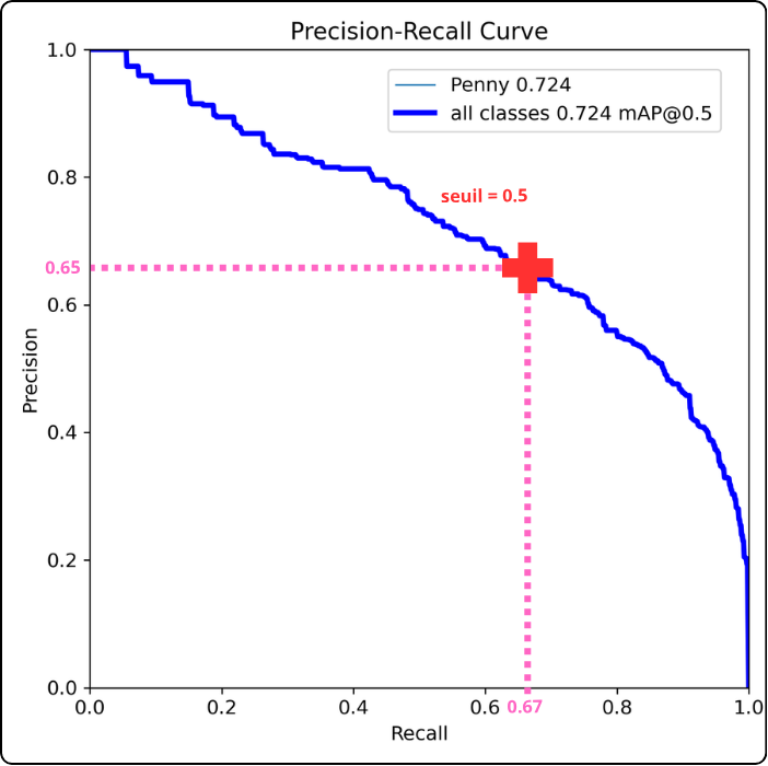
Key takeaway: the closer the curve gets to the top-right corner, the better the model performs (this example model is actually quite poor, so don’t rely on it).
FURTHER INSIGHTS
The precision-recall curve is used to compute another metric that you will encounter in the results: Average Precision (AP). This metric corresponds to the area under the precision-recall curve. It is the decimal value shown next to each class name in the legend.
By extension, mAP stands for mean Average Precision, which is the average of AP values when multiple classes are involved.
Why is this useful? As mentioned earlier, “getting closer to the top-right corner” is subjective. AP was introduced to quantify how high the curve rises, i.e., how large the area under the curve is. The higher the AP or mAP, the better the model.
EVEN FURTHER INSIGHTS
After “mAP”, you may see “@0.5”, which corresponds to the threshold value for Intersection over Union (IoU).
To understand IoU, think of it as a verification tool for the model: the model predicts a bounding box, and there is also a ground-truth bounding box. We need a way to quantify how well the predicted box matches the true one.
Consider the two boxes below:

The green box represents ground truth, and the orange box is the model’s prediction. It is not perfectly placed, but it still roughly covers the same object.
To measure this, we compute the ratio between the intersection and the union of the two boxes, as illustrated below:
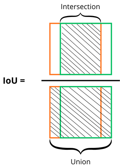
A threshold must be chosen to accept or reject predictions. For example, with an IoU threshold of 0.5, a predicted box must overlap the ground-truth box by at least 50% to be considered valid.
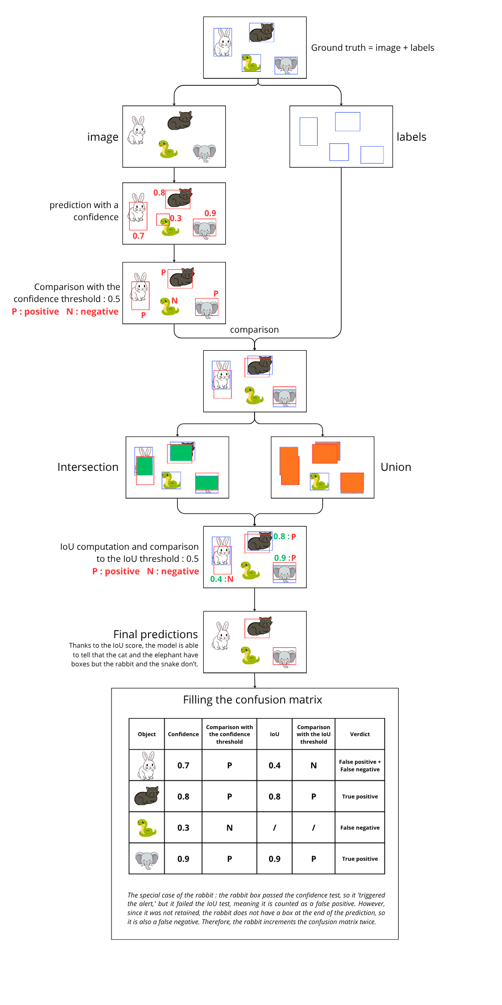
What is the difference between confidence and IoU?
Step 1: choose thresholds (arbitrarily):
- confidence threshold = 0.5
- IoU threshold = 0.5
Step 2: the model trains, processes images, and produces predictions with associated confidence scores.
Step 3: based on the confidence threshold, the model accepts predictions above the threshold and rejects the others.
Step 4: verification phase. Predicted boxes are compared to ground-truth boxes using IoU:
- If IoU ≥ threshold → true positive
- If IoU < threshold but passed confidence → false positive
Step 5: ground-truth boxes with no matching prediction are counted as false negatives.
The key difference is that the IoU threshold is only used during training, whereas the confidence threshold is crucial during deployment.
The diagram below explains what si going on with an image :
Another metric you may encounter is mAP50-95. It computes mAP across IoU thresholds from 0.5 to 0.95 (step 0.05) and takes the average.
This metric is particularly useful because it is stricter about bounding-box accuracy, making it a standard benchmark in computer vision.
F1-SCORE
The F1-score is the harmonic mean of precision and recall:

One key advantage of F1 is its sensitivity to extreme values. A model with perfect precision but very low recall will still get a poor F1 score.
This curve is used to find the optimal confidence threshold: it corresponds to the x-value of the maximum point on the curve.
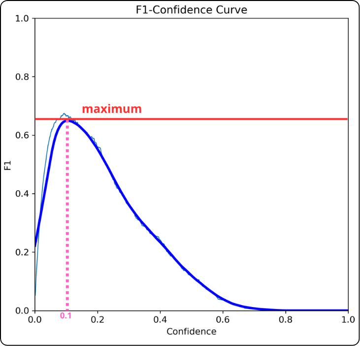
Key takeaway: the x-value at the maximum is a good candidate for your confidence threshold.
If the F1 curve forms a plateau instead of a sharp peak:
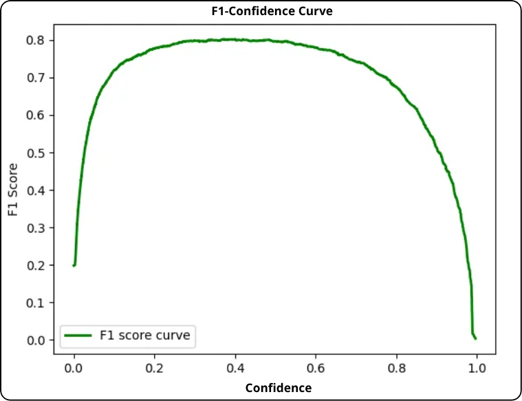
- Prioritize precision (avoid false positives): choose the right end of the plateau (higher threshold).
- Prioritize recall (avoid false negatives): choose the left end (lower threshold).
- Balanced approach: choose the center of the plateau.
-
-
-
In a multi-class context, the confusion matrix expands to include a row and a column for each category, plus a "background" dimension (corresponfing to the previous negative category) representing the absence of an object. The rows indicate predictions, and the columns represent the ground truth.
The main diagonal retains its significance as correct predictions. Classification errors now occupy all off-diagonal cells. The "background" column lists false detections, while the "background" row identifies real objects that were not detected.
To calculate performance metrics (precision, recall, F1 score) and determine the optimal confidence threshold, it is necessary to decompose this global matrix. The analysis is conducted using a "one-vs-all" approach, a 2x2 binary matrix is "generated" for each class individually, isolating the true positives, false positives and false negatives specific to that category. As previously noted, true negatives are not required for this analysis.
Let us examine how to determine the three metrics, once again using the "Penny" class as an example.
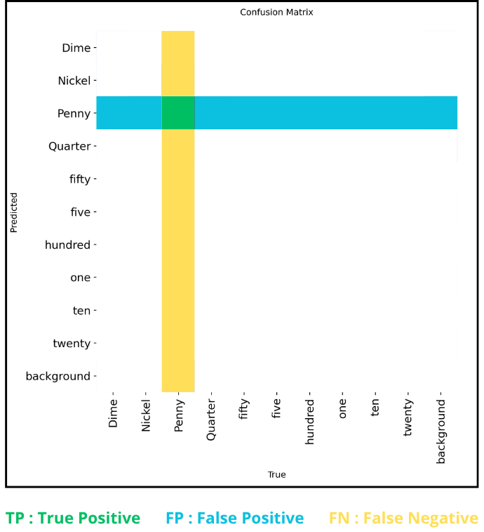
For a given class (e.g. : "penny"), the metrics are defined from the matrix as follows :
- True positives (TP) : the single cell at the intersection of the class's row and column (the diagonal).
- False positives (FP) : the sum of all other cells in the class's row (predicted as the class but belonging to another).
- False negatives (FN) : the sum of all other cells in the class's column (belonging to the class but predicted as another).
These values enable the calculation of precision and recall for a specific confidence threshold. Since each confusion matrix corresponds to a unique threshold, repeating this calculation across all possible thresholds generates the performance curves. This iterative process is repeated for each class, producing individual curves. A summary curve, termed "mean" (represented in bold on the graphs), is then derived from the aggregation of all class-specific curves, offering a global view of the model's performance.
For reference, the optimal confidence threshold value, corresponding to the x-coordinate of the F1 curve's maximum, is directly indicated in the legend, immediately following the "all classes" mention.
NORMALIZED MULTI-CLASS CONFUSION MATRIX
Finally, there is the normalized confusion matrix. It provides an overall view because instead of raw counts, it shows percentages.
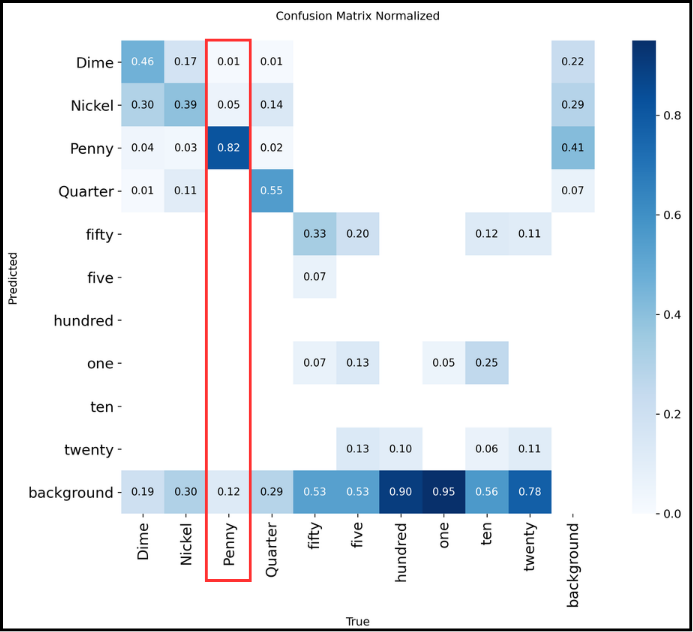
How to read it?
The normalized confusion matrix shows detection percentages for each class, so it is read column by column. For example, for “Penny” from top to bottom:
- 1% were predicted as “Dime”
- 5% were confused with “Nickel”
- 82% of “Penny” were correctly recognized
- 12% were not detected at all
The total sums to 100%, so everything is consistent.
-
-
-
labels.jpg is an image containing four plots similar to the one below:
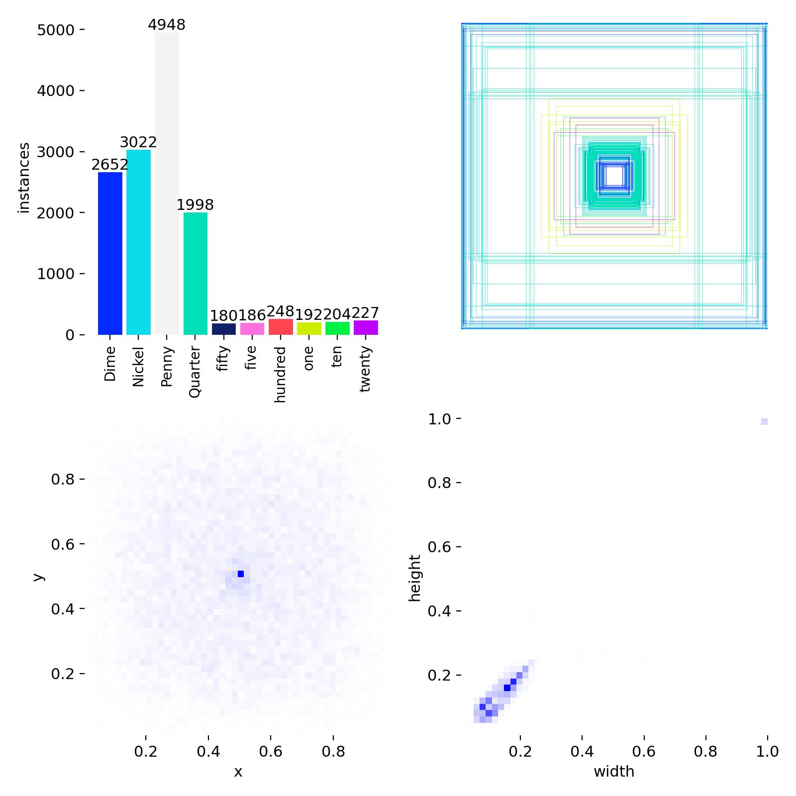
Top left: distribution of the different classes.
Top right: overlay of all bounding boxes.
Bottom left: coordinates of the centers of the bounding boxes.
Bottom right: dimensions of the bounding boxes.
These are statistics about the annotated data, this file is independent of training.
-
-
-
These documents contain the same metrics, one in CSV table form, the other in graphical form.
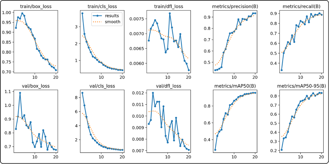
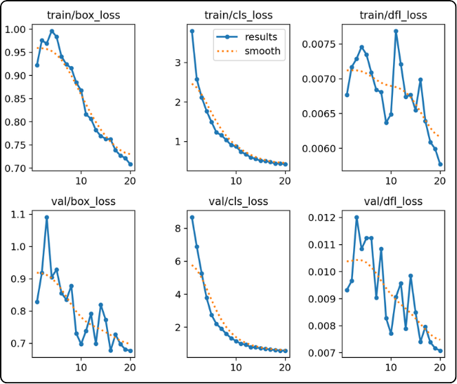
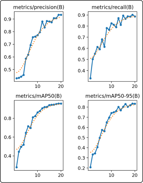
The result graphs are divided into two groups to evaluate the model's convergence and efficiency:
- the six curves on the left (the losses) : these indicate that the model is learning and making fewer errors.
The metric curves (two columns on the right): Precision, Recall, mAP50, and mAP50-95 illustrate the model's increasing competence. The objective is to observe the progression of these curves until they reach a plateau. Stabilization indicates that the model has reached its maximum potential and that training can cease. Conversely, continuous growth suggests that extending the training is necessary.
- the four curves on the right (precision, recall, mAP50, mAP50-95) : these show that the model is becoming more performant.
The loss curves (three columns on the left): These show the evolution of the error (loss) during training and validation. A simultaneous decrease in both curves is the ideal sign of a model that is learning correctly and generalizing its acquired knowledge effectively.
FOR FURTHER EXPLORATION
Overfitting occurs when the model memorizes the training data by heart instead of learning generalizable patterns. It then becomes incapable of performing well on new data.
- visual detection : this phenomenon is identified by a divergence in the loss curves. If the training curve (top) continues to descend while the validation curve (bottom) rises, the model is overfitting. The validation curve acts as a neutral witness, as the model does not train on these data.
- automatic management and resources : YOLO mitigates this risk by saving two versions: `last.pt` (the final state, potentially overfitted) and `best.pt` (the best weights recorded before validation degradation). Although `best.pt` guarantees performance, overfitting remains an unnecessary consumption of time and computational energy.
- optimization via the 'patience' parameter : to avoid this waste, it is recommended to use the `patience` parameter. This automatically stops training if no improvement is detected on the validation set after a defined number of epochs, ensuring that the process halts as soon as the model reaches its optimum.
-
-
-
If the result files of your model are satisfactory, you can then test your model on other data, especially your “test” folder.
But how do you know if your model is good? Open your results folder and let’s go through the important points to check:
- the mAP50-95 score:
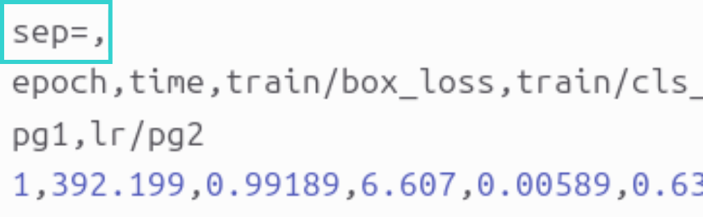
- where to find it: in the results.csv file. Important point: in this file, the separator is a comma “,” whereas Excel expects semicolons, so the file may appear unreadable. To fix this issue, first open the file in a text editor and add a first line that says “sep=,” as shown in the image below:
-
- save the modification, close the file, then open it in Excel.
- each row corresponds to an epoch and each column contains values for different losses, metrics, and learning rate for that epoch. The column we are interested in is called: metrics/mAP50-95(B).
- how to use it to evaluate your model: scroll all the way down to get the value of this metric at the last epoch of your model.
- what is a good value:
- below 0.3: bad
- above 0.5: good for complex objects
- above 0.7: excellent
- loss curves:
- where to find them: in the results.png file to directly visualize the curves and their trends.
- what to observe:
- if both curves decrease and stabilize, your model is good
- if the validation curves (val) increase while the training curves (train) decrease, your model is bad (sign of overfitting)
- F1 score curve:
- where to find it: the file BoxF1_curve.png
- what to check:
- the curve should be as high as possible, close to 1.0.
- what to extract:
- take the x-value of the maximum, as it is the optimal confidence threshold. It is written in the legend next to “all classes” as: “all classes max_value at optimal_threshold”. You take the second value to use as the “conf” parameter when deploying your model.
- valbatchXpred.jpg images:
- these images correspond to the model output, giving you a visual feedback of training. You can check whether detections are correct, bounding boxes are well placed, and no objects are missed.
VALIDATION ON THE TEST SET
If the model appears satisfactory, evaluate it on unseen data (the "test" folder) :
Loading : import the optimized model ('best.pt') located in 'runs/detect/trainX/weights' :
from ultralytics import YOLOmodel = YOLO("path/to/your/file/best.pt") # Do not hesitate to use the absolute path unless you are on the clusterConfiguration : ensure that the `data.yaml` file contains the path to the test set (or create a `data_test.yaml`).
Execution : launch the specific validation :
metrics = model.val(split="test")Analysis : Consult the results generated in `runs/detect/valX`. If performance is insufficient, retraining is necessary.
RETRAINING AND OPTIMIZATION
To improve an underperforming model, two strategies are possible:
- Extending the Training :
- You must imperatively load the weights from the last epoch ('last.pt'), not the best ones ('best.pt').
- Launch the training with the option 'resume=True'. The 'epochs' parameter then indicates the total number of epochs targeted (e.g., to go from 100 to 150 epochs, specify 'epochs=150').
from ultralytics import YOLOmodel = YOLO("path/to/your/file/last.pt")results = model.train(epochs=150, resume=True)- Adjusting Hyperparameters :
If extending the training proves insufficient, it may be necessary to modify the model's configuration (learning rate, batch size, architecture, etc.). These advanced settings, specific to each use case, are not detailed in this document; it is recommended to consult the official Ultralytics documentation or specialized online resources to explore these aspects further.
- the mAP50-95 score:
-
-
-
Once you have finished training your model, how can you use it ?
If you are working in a Python environment, you can keep the model as it is. Otherwise, you need to export it. Exporting allows you to convert a YOLO model (originally in PyTorch .pt format) into a format optimized for specific hardware. This improves inference speed (for example, up to five times faster on GPUs using TensorRT) and reduces resource usage on mobile or embedded devices. You can find all the formats supported for exporting YOLO models on the dedicated documentation page, along with explanations of the export arguments listed above.
Si vous restez dans l'environnement Python que vous aviez lors de l'entrainement, pour utiliser votre modèle, il suffit d'utiliser les lignes suivantes :
from ultralytics import YOLOmodel = YOLO("best.pt") # Charger le meilleur modèleresults = model.predict(source="chemin_vers_votre_image/image.jpg", conf=0.25) # N'oubliez pas de spécifier le seuil optimal iciL'objet results contient l'objet boxes. Et cet objet regroupe les informations suivantes pour chaque détection :
- coordonnées : accessibles via xyxy (pixels), xywh (coordonnées du centre/largeur/hauteur), ou leurs versions normalisées xyxyn et xywhn.
- confiance : l'attribut conf donne le score de probabilité (0 à 1) pour chaque boîte.
- classes : l'attribut cls contient l'index de la classe prédite.
- tracking : Si vous utilisez model.track(), l'attribut id contient les identifiants de suivi.
Voyons un exemple de code :
results = model("image.jpg")for r in results:print(r.boxes.xyxy) # Boîtes en format (x1, y1) (coordonnées du coin en haut à gauche) et (x2, y2) (coordonnées du coin en bas à droite)print(r.boxes.conf) # Scores de confianceprint(r.boxes.cls) # Index des classesVous pouvez donc récupérer les informations qui vous intéresse de cette manière et les utiliser pour des calculs ou autre dans la suite de votre code.