Section outline

    • This course is a tutorial covering the different features of Seaborn. A Jupyter Notebook will be provided, which you can run and test on Google Colab. If you want to run it locally, you will need a Python environment and the necessary tools to open and run a Jupyter Notebook.

      The entire course can be completed directly on the Moodle page, but a similar version exists on the ISDM webpage.

      The training can be completed at your own pace. As a general guideline, the course takes approximately 2 hours to complete.

    • To access the notebook, simply click on the following link: GoogleCollab, or download it as an .ipynb file and:

      • open it with the IDE (Integrated Development Environment), such as VS Code, of your choice if you wish to use it locally. You will need a Python environment and must make sure that the Seaborn library is installed in your environment.
      • have a Google account to upload the .ipynb file to your Google Drive and then double-click on it. The advantage is that you won't need to install anything this way.
    • Seaborn is a Python library used to create data visualizations (charts) in a simple and aesthetically pleasing way.

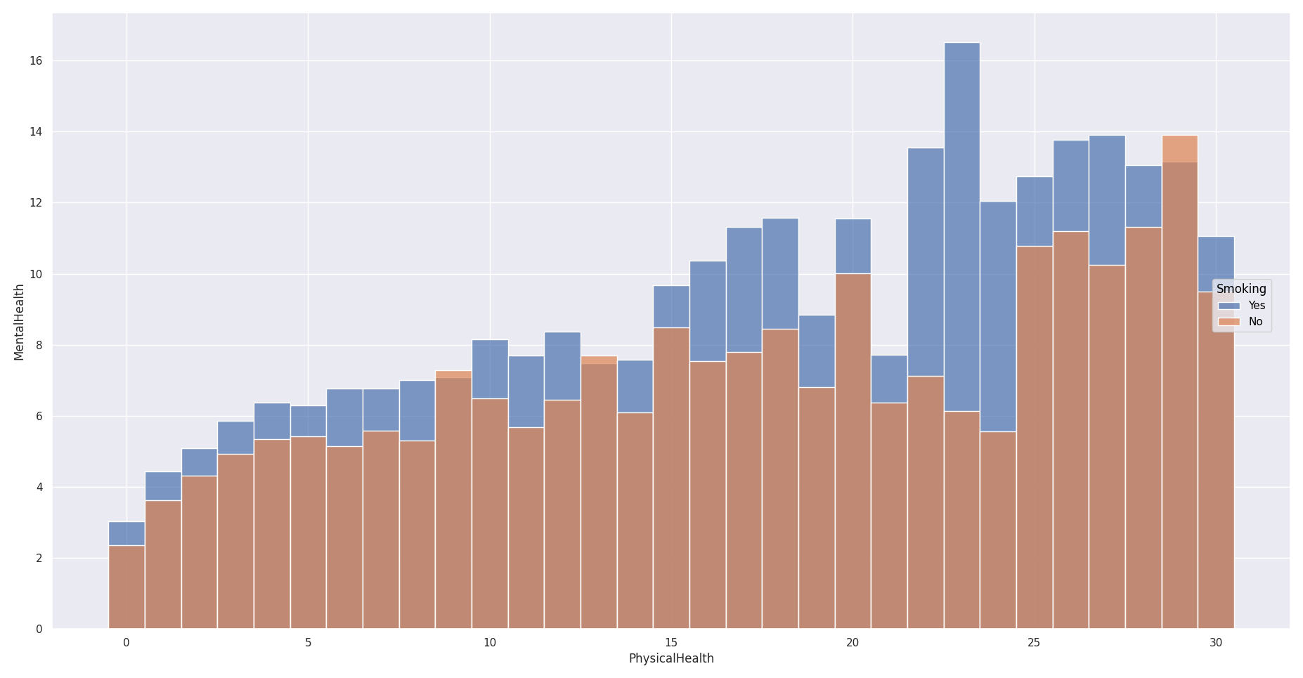
      This library can typically be used to analyze health data. Here is an example in which respondents were asked, over the previous 30 days, how many days they considered themselves to have been in poor physical health, and likewise for their mental health, with color indicating whether or not they are smokers.
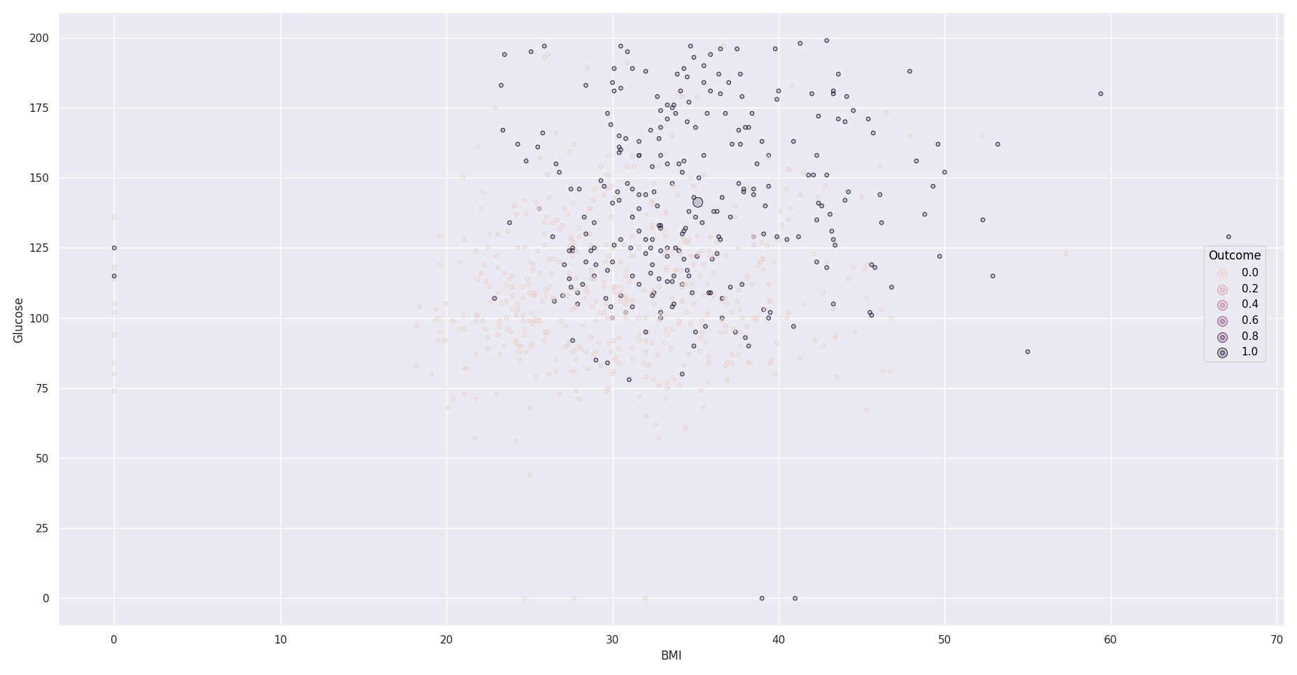
      Here is another example showing blood glucose levels according to body mass index (BMI), with people suffering from diabetes shown in black.
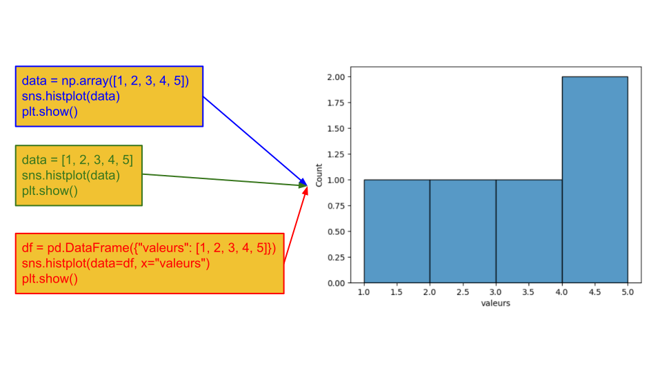
      Seaborn can be used with different types of data, including Python lists, NumPy arrays, and pandas DataFrames, although pandas DataFrames are generally preferred.
      Différents types de données

      There are different formats for data tables:

      Wide-format : 

      Var1 Value1 Value2 Value3
      Var2      
      Value1 Var3Val11 Var3Val12 Var3Val13
      Value2 Var3Val21 Var3Val22 Var3Val23
      Value3 Var3Val31 Var3Val32 Var3Val33

      The wide format is often more natural for humans, and some algorithms or functions expect data in this format. Here is an example:

      Day Temp_Paris Temp_Lyon
      Monday 20 23
      Tuesday 19 24

      Long-format : 

        Var1 Var2 Var3
      Observation1 Var1Val1 Var2Val1 Var3Val1
      Observation2 Var1Val2 Var2Val2 Var3Val2
      Observation3 Var1Val3 Var2Val3 Var3Val3

      The standard format is the long format, which allows data points to be represented using multiple different variables. Here is the previous example in long format:

      Day City Temperature
      Monday Paris 20
      Monday Lyon 23
      Tuesday Paris 19
      Tuesday Lyon 24

      Here is a description of a table in this format:
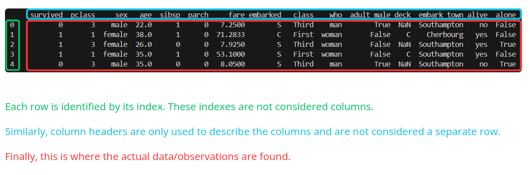

      It can be useful to check whether any data is missing, particularly if certain algorithms cannot handle missing values or if they could bias the results. Having complete data can also make tasks such as data aggregation easier. Here is the code used to check for missing data:


      data=sns.load_dataset("penguins")
      print(data.isnull())#on the whole table
      print(data.isnull().any())#on each column

      Then, if we do not want to consider observations with missing values for a given variable, for example:

      data.dropna(subset=["body_mass_g"])

      However, caution should be exercised when working with a relatively small dataset. For example, if the missing values consistently occur in the same variable, this may introduce bias. Ultimately, the decision depends on the user's judgment.


      Several datasets provided by Seaborn will be used. Below are the column names for each dataset, along with an example value.

      penguins.csv

      species 

      island 

      bill_length_mm 

      bill_depth_mm 

      flipper_length_mm 

      body_mass_g 

      sex 

      Adelie 

      Torgersen 

      39.1 

      18.7 

      181 

      3750 

      MALE 

      tips.csv

      total_bill 

      tip 

      sex 

      smoker 

      day 

      time 

      size 

      16.99 

      1.01 

      Female 

      No 

      Sun 

      Dinner 

      2 

      iris.csv

      sepal_length 

      sepal_width 

      petal_length 

      petal_width 

      species 

      5.1 

      3.5 

      1.4 

      0.2 

      setosa 

      healthexp.csv

      Year  Country  Spending_USD  Life_Expectancy 
      1970  Germany  252.311  70.6 

      glue.csv

      Model  Year  Encoder  Task  Score 
      ERNIE  2019  Transformer  CoLA  75.5 

      diamonds.csv

      carat  cut  color  clarity  depth  table  price  x  y  z 
      0.23  Ideal  E  SI12  61.5  55  326  3.95  3.98  2.43 


      This course includes editable and executable code cells. The structure will always be the same in each subsection: first, a cell used to import the necessary libraries and load the datasets we will be using, followed by editable code cells illustrating the different functions throughout the rest of the subsection.

      • Scatter plot (relplot): allows you to visualize the relationship between two quantitative variables and identify potential trends, clusters, or outliers.
      • Line plot (relplot): allows you to represent the evolution of one or more variables, particularly over time or according to an ordered variable.
      • Regression plot (regplot and lmplot): allows you to simultaneously visualize observations and the estimated relationship between two variables, facilitating the interpretation of a potential correlation.
      • Bar plot (catplot): allows you to compare categories based on aggregated values, such as a mean, sum, or count.
      • Histogram, KDE curve, and ECDF (displot):
        • the histogram represents the distribution of observations for a quantitative variable;
        • the KDE curve provides a smoothed estimate of this distribution;
        • the ECDF curve allows you to visualize the cumulative distribution and easily estimate percentiles or the proportion of observations below a given value.
      • Box plot (boxplot): summarizes the distribution of a variable using the median, quartiles, range, and outliers.
      • Letter-value plot (boxenplot): is an extension of the box plot designed for large datasets. It displays a greater number of quantiles to describe the distribution more precisely, particularly in the tails.
      • Violin plot (violinplot): combines information from a box plot with a density estimate, providing a better visualization of the shape of the distribution.
      • Heatmap (heatmap): represents the values of a matrix using color coding, making it easier to identify patterns, concentrations, or variations in the data.
      • Clustered heatmap (clustermap): combines a heatmap with hierarchical clustering of rows and columns based on their similarity, in order to highlight structures or groups within quantitative data.
        • What is quantitative data?

          Quantitative, or numerical, data, as the name suggests, consist of measurable values, that is, numbers.


          We will introduce and test the different types of charts that can be created with Seaborn.


        • The relplot() function can be used to create scatter plots and line plots.

          Here is the function signature:
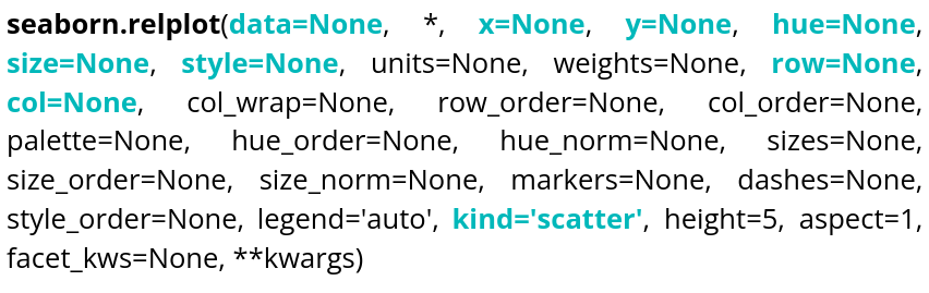
          Signature relplot

          There is, of course, documentation available online, so we will only cover the most essential elements needed to display what we need as quickly as possible, namely:

          Parameter name Explanations Required type Example
          data Table you are planning to use DataFrame, Series, dict, array, or list of arrays data=table
          x Variable of the table for the x-axis string corresponding to a variable of the table x="weight"
          y Variable of the table for the y-axis string corresponding to a variable of the table y=”height”
          hue Variable of the table to distinguish with colors string corresponding to a variable of the table hue=”age”
          size Variable of the table to distinguish with different sizes string corresponding to a variable of the table size=”money”
          style Variable of the table to distinguish with different styles string corresponding to a variable of the table style=”sex”
          row Variable of the table that will be used to make different plots, in rows string corresponding to a variable of the table row=”category”
          col Variable of the table that will be used to make different plots, in columns string corresponding to a variable of the table col=”job”
          kind Type of plot desired string, 2 choices kind=”scatter” or kind=”line”

          Here is an example using the following code, which you can run:

          Importation Code
          ← Running
          Cell 2
          ← Running

          It can be observed that col allows you to create different plots within the same figure, hue uses colors to distinguish one variable, and style uses the shape of the markers to distinguish another variable. You can experiment with different parameters and rerun the code.


          Ellipses can be added to relplot scatter plots. To draw on the plot, you first need to retrieve the ax object:

          Cell 3
          ← Running

          Ellipse comes from matplotlib.patches.


          You can also display line plots by setting kind to "line":

          Cell 4
          ← Running

          size cannot be used with a plot of kind "line".
          This time, style changes the line style according to the value of the "sex" variable.


        •  

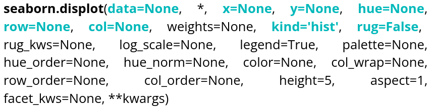
          The displot() function allows you to display different types of distributions.

          signature displot

           
          Parameter name Explanations Required type Example
          data

          Table you are planning to use

          DataFrame, Series, dict, array, or list of arrays data=tableau
          x Variable of the table for the x-axis string corresponding to a variable of the table x="weight"
          y Variable of the table for the y-axis string corresponding to a variable of the table y=”height”
          hue Variable of the table to distinguish with colors string corresponding to a variable of the table hue=”age”
          row Variable of the table that will be used to make different plots, in rows string corresponding to a variable of the table row=”category”
          col Variable of the table that will be used to make different plots, in columns string corresponding to a variable of the table col=”job”
          kind Type of plot desired string, 3 choices kind=”hist”,kind=”kde” or kind=”ecdf”
          rug Allows to see individual values on the 2 axes Boolean rug=True
           
          Importation Code
          ← Running

          Here is an editable example code that allows you to create a histogram:
          Cell 2
          ← Running

          If no data is specified for the y-axis, the y-axis will represent the number of occurrences. If kind is not specified, a histogram is displayed by default.

          The bins argument controls the number of bars. The rug parameter allows you to visualize individual observations along the axes of the plot.


          We can also use Kernel Density Estimation (KDE) to estimate a distribution. Here is an example of how to use it:

          Cell 3
          ← Running

          If a variable is specified for y:

          Cell 4
          ← Running

          A plot of this type can be read like a contour map. Each line connects points with similar probability densities. The centers of the contours correspond to areas of higher density.


          The last type of distribution available is the ECDF (Empirical Cumulative Distribution Function). The y parameter cannot be specified for this type of distribution, as it is univariate.

          Cell 5
          ← Running
           

          The row parameter allows you to display even more plots based on another variable in the dataset. The data contains three penguin species, so there are three rows of plots. There are two sexes in the dataset, so there are two columns. height controls the height of the plots.


        • A common graphical representation of data is the box plot, which can be created using boxplot().
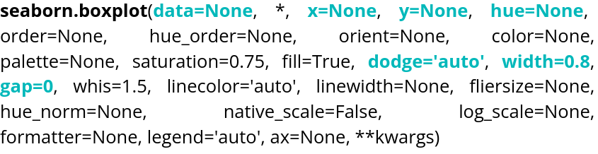
          signature boxplot

          Parameter name Explanations Required type Example
          data

          Table you are planning to use

          DataFrame, Series, dict, array, or list of arrays data=tableau
          x Variable of the table for the x-axis string corresponding to a variable of the table x="weight"
          y Variable of the table for the y-axis string corresponding to a variable of the table y=”height”
          hue Variable of the table to distinguish with colors string corresponding to a variable of the table hue=”age”
          dodge Variable allowing to choose if the content overlap Boolean dodge=False
          width Variable allowing to control the width of the boxes Float value  width=0.5
          gap Variable allowing to control the size of the gap between the "dodged" boxes Float value gap=0.1

          Here is an example of code that you can modify and run:

          Importation Code
          ← Running
          Cell 2
          ← Running


          By default, gap is set to 0. The orientation is handled automatically by Seaborn, but if the plot is two-dimensional with two numerical variables, it can be specified using orient, which can be set to "h" or "v".

          Cell 3
          ← Running


          log_scale allows you to change the scale. A numerical value specifies the base, which is 10 by default. If the plot is two-dimensional, two values can be provided, one for each axis.


          The violin plot is also available through violinplot().

          signature violinplot

          Parameter name Explanations Required type Example
          data

          Table you are planning to use

          DataFrame, Series, dict, array, or list of arrays data=tableau
          x Variable of the table for the x-axis string corresponding to a variable of the table x="weight"
          y Variable of the table for the y-axis string corresponding to a variable of the table y=”height”
          hue Variable of the table to distinguish with colors string corresponding to a variable of the table hue=”age”
          inner Variable allowing to choose the inner representation of the violin string corresponding to a type of representation inner=”box”,inner=”quart”,inner=”point”
          split Variable allowing to choose if the violin will be symetric Boolean split=True
          width Variable allowing to control the width of the violin Float value width=0.5
          dodge Variable allowing to choose if the content overlap Boolean dodge=False
          gap Variable allowing to control the size of the gap between the "dodged" violins Float value gap=0.1

          Here is an example of code to run:

          Cell 4
          ← Running
          split allows two distributions to be displayed on the same violin plot, as they are symmetrical. linewidth controls the thickness of the outline.

          We displayed the individual data points inside the violin plot, but we can instead choose to display a miniature box plot using inner="box":


          Cellule 5
          ← Running


        • If you want to perform linear regressions, Seaborn provides a dedicated function: regplot().
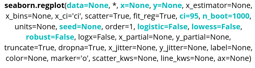
          Parameter name Explanations Required type Example
          data

          Table you are planning to use

          DataFrame, Series, dict, array, or list of arrays data=table
          x Variable of the table for the x-axis string corresponding to a variable of the table x="weight"
          y Variable of the table for the y-axis string corresponding to a variable of the table y=”height”
          ci Variable allowing to control the confidence interval Integer between 1 and 100 ci=99
          nboot Variable allowing to choose the number of bootstrap resampling done. Integer nboot=100
          seed Variable allowing reproductibility by choosing the seed of the bootstrap. Integer seed=42
          logistic Variable allowing to do a logistic regression Boolean logistic=True
          lowess Variable allowing to do a LOWESS regression Boolean lowess=True
          robust Variable allowing to do a robust regression. Higher computing cost Boolean robust=True
           

          regplot() can also display the confidence interval around the regression line, which is set to 95% by default.


          Here is an editable example of code:

          Importation code
          ← Running
          Cell 2
          ← Running
           
          Here, we are 70% confident that the true regression curve lies within the interval displayed on the graph. By default, n_boot is set to 1000. Increasing this value will necessarily increase the code's execution time, as additional resampling iterations will be performed. seed allows you to reproduce the same resampling results by using an integer as a seed, which is useful for reproducibility when writing a scientific paper or verifying that a method works correctly.
           

          The regression method can also be changed by selecting a different approach, for example by setting the lowess parameter to True:


          Cell 3
          ← Running

          The confidence interval is not displayed when using LOWESS.
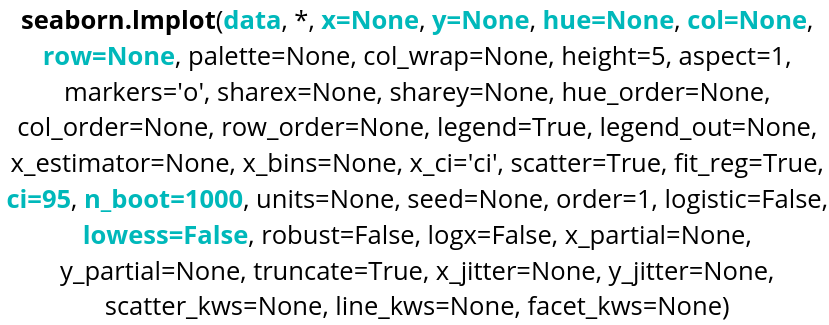

          Another option is lmplot(), which is better suited for performing regressions across multiple plots:


          signature lmplot

          Parameter name Explanations Required type Example
          data

          Table you are planning to use

          DataFrame, Series, dict, array, or list of arrays data=tableau
          x Variable of the table for the x-axis string corresponding to a variable of the table x="weight"
          y Variable of the table for the y-axis string corresponding to a variable of the table y=”height”
          hue Variable of the table to distinguish with colors string corresponding to a variable of the table hue=”age”
          row Variable of the table that will be used to make different plots, in rows string corresponding to a variable of the table row=”category”
          col Variable of the table that will be used to make different plots, in columns string corresponding to a variable of the table col=”job”
          ci Variable allowing to control the confidence interval Integer between 1 and 100 ci=99
          nboot Variable allowing to choose the number of bootstrap resampling done. Integer nboot=100
          lowess Variable allowing to do a LOWESS regression Boolean lowess=True

          Here is an example of code:

          Cell 4
          ← Running

          Robust and logistic regressions are also available, just as with regplot(). The nboot and seed parameters are also available.


        • Seaborn also allows you to create heatmaps using heatmap().
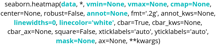
          Parameter name Explanations Required type Example
          data Table you are planning to use DataFrame, Series, dict, array, or list of arrays data=table
          cmap Heatmap colors: either a Matplotlib color palette or a custom palette. String corresponding to a color palette or color_palette of Seaborn cmap="viridis" or cmap=sns.color_palette("light:blue", as_cmap=True)
          annot Variable that determines whether the cell values are displayed. Boolean annot=True, False by default
          vmin Minimum value considered for the colormap. Float value vmin=30.6
          vmax Maximum value considered for the colormap. Float value vmax=42
          linecolor Variable used to choose the color of the lines between cells. String corresponding to a color linecolor="blue"
          linewidths Variable controlling the thickness of the lines between cells. Float value linewidths=0.2 or linewidths=10
          mask Variable used to control the values displayed in the heatmap. Boolean table with the same format as data mask=tableau_mask

          Here is an example of code:

          Importation Code
          ← Running
          Cell 2
          ← Running

          We use pivot to format the data in the desired order:

          • index specifies the variable for the y-axis.
          • columns specifies the variable for the x-axis.
          • values must be a numerical variable, and this is what the heatmap will use to determine the cell colors.
          Cell 3
          ← Running

          With the vmin and vmax parameters, we can define the range of values over which the heatmap will be applied. We also have graphical options such as linecolor and linewidths to customize the lines between cells. annot displays the values in each cell of the heatmap.


          If you need to perform clustering on a heatmap, you can use Seaborn's clustermap(). Note that this function requires SciPy, so you will need to install it in the environment you are working in. If you are using Google Colab, this will not be necessary, as you can import it directly.
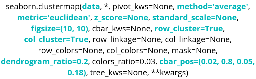
          signature clustermap

          Parameter name Explanations Required type Example
          data Table you are planning to use DataFrame, Series, dict, array, or list of arrays data=table
          method SciPy method for clustering String corresponding to a SciPy method method="centroid"
          metric SciPy metric for clustering String corresponding to a SciPy metric metric="jaccard"
          z_score Variable used to standardize the data 0 for rows, 1 for columns z_score=0
          standard_scale Variable used to normalize the data 0 for rows, 1 for columns standard_scale=1
          row_cluster,
          col_cluster
          Variables used to choose the clustering axes Boolean row_cluster=False
          figsize Variable controlling the size of the figure tuple(width,height) figsize=(4,4)
          dendrogram_ratio Variable controlling the size ratio of the dendrograms tuple(row ratio, column ratio) dendrogram_ratio=(0.2,0.1)
          cbar_pos Variable controlling the position of the color bar tuple(left,bottom,width,height) cbar_pos=(0,0.1,0.05,0.6)

          Here is an example of code:

          Cell 4
          ← Running

          We remove the extra variable using pop() to perform the clustering. In this case, the variable is "species", which we will reuse later.

          The dendrograms are the trees displayed on the sides of the clustermap that represent the different clusters formed.

          Now, let's explore some of the different parameters:

          Cell 5
          ← Running

          row_cluster groups the rows according to their similarity in order to reveal clusters. dendrogram_ratio controls the size of the dendrograms; the first value corresponds to the one on the left and the second to the one at the top. row_colors adds a color next to the rows. Here, using the previous lines, the species corresponding to each row are displayed.

          metric allows you to choose the similarity distance used, while method specifies the algorithm used to perform the clustering. Setting z_score to 1 indicates that the data is normalized across the rows. cbar_pos allows you to choose the position of the color bar. annot displays the values in each cell. figsize controls the size of the figure.

           
        •  
          What is qualitative data?
           

          Qualitative, or categorical, data are, in contrast to quantitative data, data that do not represent numerical measurements. They can include strings (for example, names) or Boolean values (True/False, yes/no, 1/0, etc.).

          Qualitative data can be plotted using the tools presented previously. However, there is an all-in-one tool that makes it easy to switch from one visualization type to another.


        •  

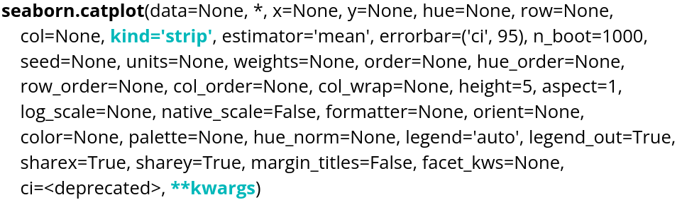
          The catplot() function allows you to create different types of plots:

          signature catplot


          Parameter name Explanations Type required Example
          data

          table you are planning to use

          DataFrame, Series, dict, array, or list of arrays data=table
          x variable of the table for the x-axis string corresponding to a variable of the table x="weight"
          y variable of the table for the y-axis string corresponding to a variable of the table y="height"
          kind type of plot desired string kind="swarm"

          There are several kind options that can be used:

          • strip
          • swarm
          • violin
          • box
          • boxen
          • point
          • bar
          • count

          Importation Code
          ← Running
          Cell 2
          ← Running

          The "point" and "bar" plots display the mean along with its confidence interval. These are calculated using bootstrap resampling.


          We can use the parameters of the selected plot types. For example, boxplot() has the fill parameter, so we can specify it directly in the catplot() function.

          Cell 3
          ← Running


    •  

      Seaborn provides several functions for creating multiple plots at the same time.


      Let's start with jointplot(). It allows us to display a plot using x and y data, while also displaying an additional plot on each axis representing the distribution of the variable on that axis. Here is an example using the penguins dataset:

      Importation Code
      ← Running
      Cell 2
      ← Running

      The for loop in the code allows us to display the individual points in addition to the plots. This is Matplotlib code.


      An alternative that provides more control and customization is JointGrid(). In particular, it allows us to use different plot types for the central plot and for the plots on the axes.

      Cell 3
      ← Running

      plot_joint() controls the type of the central plot, while plot_marginals() controls the plots on the axes.


      Another type of visualization is pairplot(). It allows us to display the plots for every possible pair of variables in a single figure, along with the distribution of each variable on the diagonal.

      If our data contains the variables x, y, and z, we will have the following plots:

      • x versus y, y versus x
      • y versus z, z versus y
      • z versus x, x versus z

      On the diagonal, we will have the distribution of x, y, and z.


      Cell 4
      ← Running

      We can change the type of plot on the diagonal and elsewhere using diag_kind for the diagonal and kind for the other plots. diag_kind can only take "hist" or "kde" as values, while kind also provides access to "scatter", which is the default value.


      As with jointplot(), pairplot() has a complementary function that provides greater control and customization: PairGrid(). With this function, for example, we can choose different types of plots above and below the diagonal.

      Cell 5
      ← Running

      map_upper(), map_lower() and map_diag() allow you to control the different types of plots in the figure. They can be used with any type of Seaborn plotting function that accepts x and y arguments.


      Finally, we have the FacetGrid() representation. Unlike the previous functions, it does not automatically create different types of plots within a figure. Instead, it allows us to manually organize the plots using col and row, while also providing the ability to customize individual plots within the figure. It is therefore a function that is somewhat closer to Matplotlib.

      Cell 6
      ← Running
       

        • Since the release of Seaborn 0.12, the Seaborn Objects API has been introduced. It provides a powerful alternative to the original plotting functions. This API is inspired by ggplot2 in R.

          We will use a simple example. First, we import the objects as follows:

          import seaborn.objects as so
           

          The way graphs are constructed using the objects API is specific. A single function is used to create plots:

          so.Plot()

          To this function, we specify the data that we are going to use:

          so.Plot(tips,x=”total_bill”)

          Here, tips is Seaborn's tips dataset.

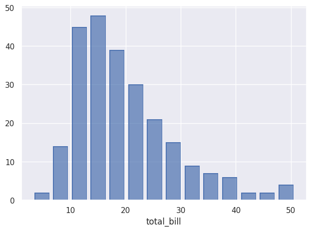
          Once the data has been specified, we can decide what to do with it using add(). Here, we create a histogram:

          so.Plot(tips,x=”total_bill”).add(so.Bar(),so.Hist()).show()
          

          And here is the result:

          histogramme seaborn object exemple

        • The equivalent of the scatterplots that can be created with relplot() is the Dot() object. After the import cell, all the code will be editable.

          Importation Code
          ← Running
          Cell 2
          ← Running

          color plays the same role as the hue parameter introduced earlier, allowing the data to be differentiated according to a variable. marker allows another variable to be used to differentiate observations using different marker types, similarly to the style parameter. facet() serves a similar purpose to row and col, allowing the data to be distributed across multiple subplots. Finally, limit allows the display to be restricted to specific ranges on the x and/or y axes.

          We can also easily add a regression curve using Line() and PolyFit():

          Cell 3
          ← Running

          This same Line() can have different types, such as PolyFit(), but it can also be used as a representation of the data:

          Cell 4
          ← Running

          If no type is specified for Line(), the data points are connected with lines. An interesting feature of using pandas DataFrames, as returned by load_dataset(), is that we can use .query() to perform SQL-like queries to select specific data. Here, we select only diamonds whose cut is Ideal and whose color belongs to a specific set of colors. The chained pipe() function passes this selected DataFrame as an argument to Plot(), after which other arguments such as x, y, and linestyle can be specified. The plotted line does not correspond to each individual observation. Indeed, using Agg() allows the data to be aggregated: each price value for a given depth is aggregated and averaged in the plot. The Band() and Est() objects can be used to display uncertainty around the curves.

          The Path() object is an alternative to Line(), particularly suited for representing trajectories, as it connects the data points in the order in which they are presented.

          Cell 5
          ← Running

          If we want to display the area under curves, we can use Area(). The wrap parameter of facet() allows us to choose how many plots are displayed per row.

          Cell 6
          ← Running
           

          We can stack the areas using Stack().

          Cell 7
          ← Running

          The Range() object allows intervals to be displayed and requires either bounds or an Est() object to calculate what should be displayed. With the latter, the mean and its confidence interval are displayed. Bounds can also be explicitly provided to define the interval to be displayed.

          Cell 8
          ← Running


          To create histograms, we use Bar() together with Hist(). We can choose the type of statistic to use. By default, "count" is used, but we can choose "density" for probability densities, "percent" for percentages, "probability" for proportions, or "frequency" for frequency.

          Cell 9
          ← Running

          Bar() can also be used to display, for example, a mean with Agg(), which allows data to be aggregated. Dodge() performs the same function as the dodge parameter in non-object-based plots.

          Cell 10
          ← Running

          To simply count occurrences, we can also use Bar(), combined with Count().

          Cell 11
          ← Running

          Seaborn objects can also be used to display percentiles with Perc(). We can choose which percentiles we want to display, and here we display them as Dot(). If no specific percentiles are selected, the default percentiles are [20, 40, 60, 80, 100].

          Cell 12
          ← Running
           

          We can create a graph by adding different intervals corresponding to percentiles with Range(), and use Shift() to offset them so that they remain visible. Here, scale() allows us to modify the scale of the axes, in this case the x-axis.

          Cell 13
          ← Running

          We can also normalize the values using Norm(). Here, we normalize the values relative to the minimum year, which is 1970.

          Cell 14
          ← Running

          The Dot(), Line(), Path(), and Bar() objects have variants (Dots, Lines, etc.) that are better suited to large datasets. 


          We can also modify the scale of the axes using scale(). Different options are available, such as "log" and "sqrt", as well as "log2" and "log10".

          Cell 15
          ← Running


    • There are various visual options available in Seaborn, including different point styles, line styles, and color palettes.
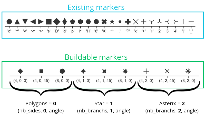
      Here is an example of code:

      Importation Code
      ← Running
      Cell 2
      ← Running

      We can also modify the type of lines we use:
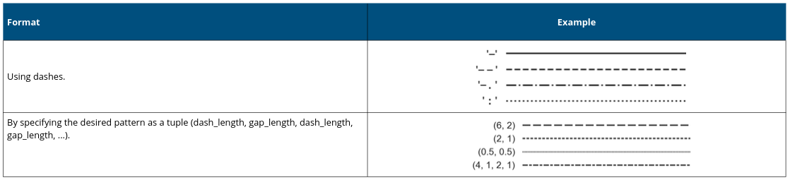
      Here is an example:

      Cell 3
      ← Running

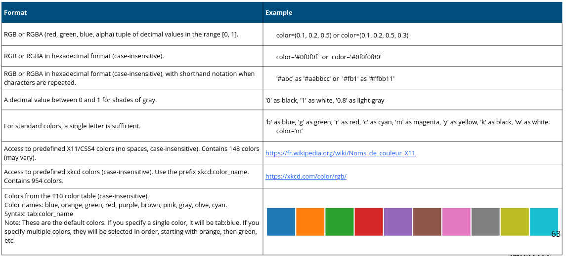
      We can also choose specific colors:

      Here is an example :

      Cell 4
      ← Running

      We can also define colors using color palettes:
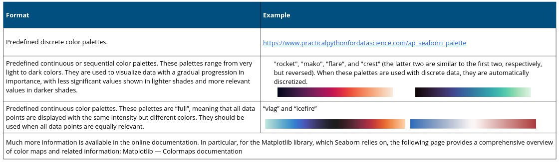
      And here is an example using code from earlier:

      Cell 5
      ← Running