Section outline
-
These documents contain the same metrics, one in CSV table form, the other in graphical form.
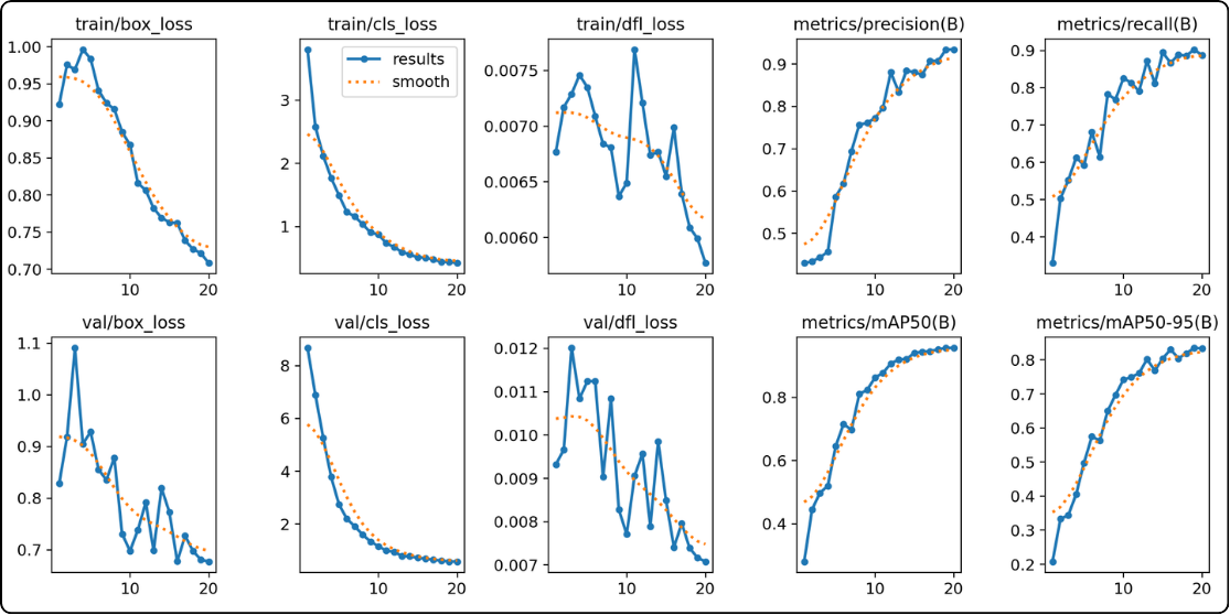
- The six curves on the left (the losses) : the model is learning and making fewer errors
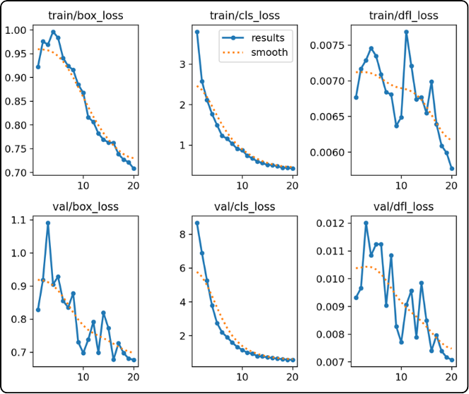
These 6 curves correspond to the error between predictions and ground truth, with training on the top and validation on the bottom.
During training, there is a phenomenon to be careful about: overfitting. Simply put, it means the model is learning the training data by heart.
Why is this a problem? Because the model will no longer generalize well to different data, even if it is similar.
How can we tell if the model is overfitting? This can be seen using the validation data, since the model does not train on it; it only uses it for evaluation.
So when looking at the loss curves, if the training curves (top) continue to decrease while the validation curves (bottom) start increasing at some point, it is a sign of overfitting because validation losses begin to rise again.
In the example above, we can see that the validation curves keep decreasing, which indicates that the model is currently generalizing well.
If overfitting occurs, what are the consequences?
As mentioned earlier, YOLO saves two models: best.pt and last.pt. In last.pt, you will find the overfitted model. However, in best.pt, YOLO stores the weights that achieved the best combined performance on training and validation, i.e., before overfitting occurs.
So if best.pt already contains weights from before overfitting, what is the problem of overfitting? It can be seen as a waste of computational resources, since the model goes too far. To address this, we can use the “patience” parameter, which tells the model: “if after x epochs the model does not improve anymore (i.e., best.pt weights do not change), then stop training”, where x is a positive integer.
- The four curves on the right (precision, recall, mAP50, mAP50-95) : the model becomes more performant
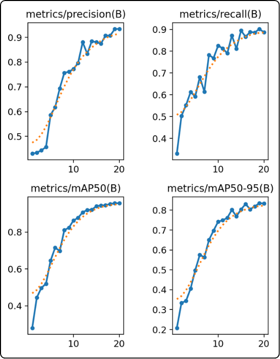
They allow us to see whether the model has reached its full potential.
These curves help visualize whether the model is improving. A good indicator that the model is reaching its final state is when these curves reach a plateau. In that case, we know the model has reached its best performance and has no further improvement potential.
For example, in the case above, we can see that after 20 epochs, the curves are still increasing, which indicates that the model would need more epochs to stabilize.