Section outline
-
-
The relplot() function can be used to create scatter plots and line plots.
Here is the function signature:
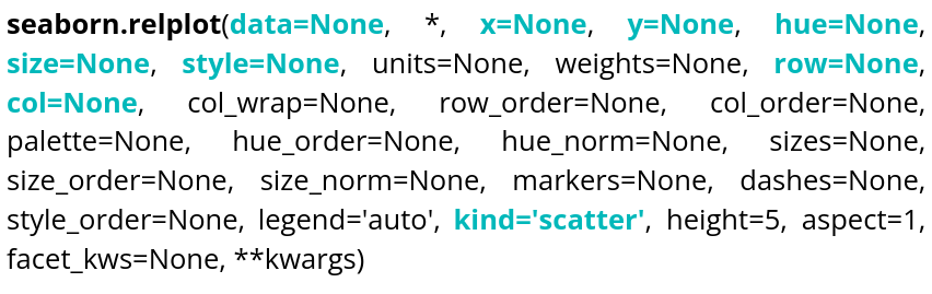
There is, of course, documentation available online, so we will only cover the most essential elements needed to display what we need as quickly as possible, namely:
Parameter name Explanations Required type Example data Table you are planning to use DataFrame, Series, dict, array, or list of arrays data=table x Variable of the table for the x-axis string corresponding to a variable of the table x="weight" y Variable of the table for the y-axis string corresponding to a variable of the table y=”height” hue Variable of the table to distinguish with colors string corresponding to a variable of the table hue=”age” size Variable of the table to distinguish with different sizes string corresponding to a variable of the table size=”money” style Variable of the table to distinguish with different styles string corresponding to a variable of the table style=”sex” row Variable of the table that will be used to make different plots, in rows string corresponding to a variable of the table row=”category” col Variable of the table that will be used to make different plots, in columns string corresponding to a variable of the table col=”job” kind Type of plot desired string, 2 choices kind=”scatter” or kind=”line”
It can be observed that col allows you to create different plots within the same figure, hue uses colors to distinguish one variable, and style uses the shape of the markers to distinguish another variable. You can experiment with different parameters and rerun the code.
Ellipses can be added to relplot scatter plots. To draw on the plot, you first need to retrieve the ax object:Ellipse comes from matplotlib.patches.
You can also display line plots by setting kind to
"line":size cannot be used with a plot of kind
"line".
This time, style changes the line style according to the value of the"sex"variable.
-