Section outline
-
-
-
-
The relplot() function can be used to create scatter plots and line plots.
Here is the function signature:
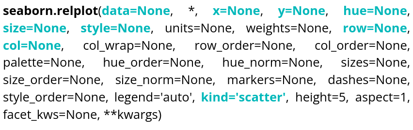
There is, of course, documentation available online, so we will only cover the most essential elements needed to display what we need as quickly as possible, namely:
Parameter name Explanations Required type Example data Table you are planning to use DataFrame, Series, dict, array, or list of arrays data=table x Variable of the table for the x-axis string corresponding to a variable of the table x="weight" y Variable of the table for the y-axis string corresponding to a variable of the table y=”height” hue Variable of the table to distinguish with colors string corresponding to a variable of the table hue=”age” size Variable of the table to distinguish with different sizes string corresponding to a variable of the table size=”money” style Variable of the table to distinguish with different styles string corresponding to a variable of the table style=”sex” row Variable of the table that will be used to make different plots, in rows string corresponding to a variable of the table row=”category” col Variable of the table that will be used to make different plots, in columns string corresponding to a variable of the table col=”job” kind Type of plot desired string, 2 choices kind=”scatter” or kind=”line”
It can be observed that col allows you to create different plots within the same figure, hue uses colors to distinguish one variable, and style uses the shape of the markers to distinguish another variable. You can experiment with different parameters and rerun the code.
Ellipses can be added to relplot scatter plots. To draw on the plot, you first need to retrieve the ax object:Ellipse comes from matplotlib.patches.
You can also display line plots by setting kind to
"line":size cannot be used with a plot of kind
"line".
This time, style changes the line style according to the value of the"sex"variable.
-
-
-
-
-
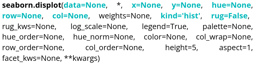
Parameter name Explanations Required type Example data Table you are planning to use
DataFrame, Series, dict, array, or list of arrays data=tableau x Variable of the table for the x-axis string corresponding to a variable of the table x="weight" y Variable of the table for the y-axis string corresponding to a variable of the table y=”height” hue Variable of the table to distinguish with colors string corresponding to a variable of the table hue=”age” row Variable of the table that will be used to make different plots, in rows string corresponding to a variable of the table row=”category” col Variable of the table that will be used to make different plots, in columns string corresponding to a variable of the table col=”job” kind Type of plot desired string, 3 choices kind=”hist”,kind=”kde” or kind=”ecdf” rug Allows to see individual values on the 2 axes Boolean rug=True Here is an editable example code that allows you to create a histogram:If no data is specified for the y-axis, the y-axis will represent the number of occurrences. If kind is not specified, a histogram is displayed by default.
The bins argument controls the number of bars. The rug parameter allows you to visualize individual observations along the axes of the plot.
We can also use Kernel Density Estimation (KDE) to estimate a distribution. Here is an example of how to use it:
If a variable is specified for y:
The last type of distribution available is the ECDF (Empirical Cumulative Distribution Function). The y parameter cannot be specified for this type of distribution, as it is univariate.
-
-
-
-
-
A common graphical representation of data is the box plot, which can be created using boxplot().
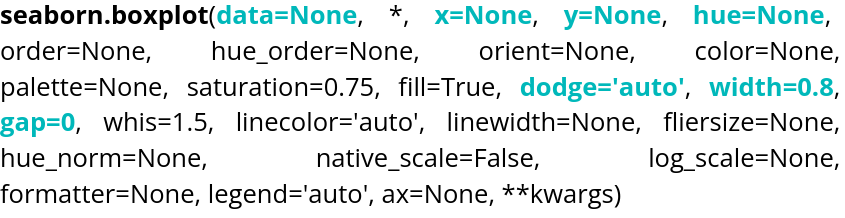
Parameter name Explanations Required type Example data Table you are planning to use
DataFrame, Series, dict, array, or list of arrays data=tableau x Variable of the table for the x-axis string corresponding to a variable of the table x="weight" y Variable of the table for the y-axis string corresponding to a variable of the table y=”height” hue Variable of the table to distinguish with colors string corresponding to a variable of the table hue=”age” dodge Variable allowing to choose if the content overlap Boolean dodge=False width Variable allowing to control the width of the boxes Float value width=0.5 gap Variable allowing to control the size of the gap between the "dodged" boxes Float value gap=0.1
By default, gap is set to 0. The orientation is handled automatically by Seaborn, but if the plot is two-dimensional with two numerical variables, it can be specified using orient, which can be set to"h"or"v".
The violin plot is also available through violinplot().

Parameter name Explanations Required type Example data Table you are planning to use
DataFrame, Series, dict, array, or list of arrays data=tableau x Variable of the table for the x-axis string corresponding to a variable of the table x="weight" y Variable of the table for the y-axis string corresponding to a variable of the table y=”height” hue Variable of the table to distinguish with colors string corresponding to a variable of the table hue=”age” inner Variable allowing to choose the inner representation of the violin string corresponding to a type of representation inner=”box”,inner=”quart”,inner=”point” split Variable allowing to choose if the violin will be symetric Boolean split=True width Variable allowing to control the width of the violin Float value width=0.5 dodge Variable allowing to choose if the content overlap Boolean dodge=False gap Variable allowing to control the size of the gap between the "dodged" violins Float value gap=0.1 Here is an example of code to run:
-
-
-
-
-
If you want to perform linear regressions, Seaborn provides a dedicated function: regplot().
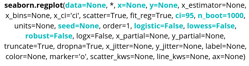
Parameter name Explanations Required type Example data Table you are planning to use
DataFrame, Series, dict, array, or list of arrays data=table x Variable of the table for the x-axis string corresponding to a variable of the table x="weight" y Variable of the table for the y-axis string corresponding to a variable of the table y=”height” ci Variable allowing to control the confidence interval Integer between 1 and 100 ci=99 nboot Variable allowing to choose the number of bootstrap resampling done. Integer nboot=100 seed Variable allowing reproductibility by choosing the seed of the bootstrap. Integer seed=42 logistic Variable allowing to do a logistic regression Boolean logistic=True lowess Variable allowing to do a LOWESS regression Boolean lowess=True robust Variable allowing to do a robust regression. Higher computing cost Boolean robust=True
The confidence interval is not displayed when using LOWESS.
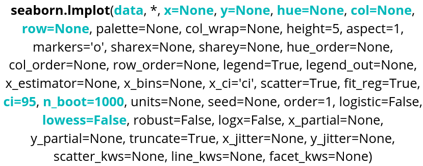
Parameter name Explanations Required type Example data Table you are planning to use
DataFrame, Series, dict, array, or list of arrays data=tableau x Variable of the table for the x-axis string corresponding to a variable of the table x="weight" y Variable of the table for the y-axis string corresponding to a variable of the table y=”height” hue Variable of the table to distinguish with colors string corresponding to a variable of the table hue=”age” row Variable of the table that will be used to make different plots, in rows string corresponding to a variable of the table row=”category” col Variable of the table that will be used to make different plots, in columns string corresponding to a variable of the table col=”job” ci Variable allowing to control the confidence interval Integer between 1 and 100 ci=99 nboot Variable allowing to choose the number of bootstrap resampling done. Integer nboot=100 lowess Variable allowing to do a LOWESS regression Boolean lowess=True Here is an example of code:
Robust and logistic regressions are also available, just as with regplot(). The nboot and seed parameters are also available.
-
-
-
-
-
Seaborn also allows you to create heatmaps using heatmap().
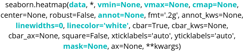
Parameter name Explanations Required type Example data Table you are planning to use DataFrame, Series, dict, array, or list of arrays data=table cmap Heatmap colors: either a Matplotlib color palette or a custom palette. String corresponding to a color palette or color_palette of Seaborn cmap="viridis" or cmap=sns.color_palette("light:blue", as_cmap=True) annot Variable that determines whether the cell values are displayed. Boolean annot=True, False by default vmin Minimum value considered for the colormap. Float value vmin=30.6 vmax Maximum value considered for the colormap. Float value vmax=42 linecolor Variable used to choose the color of the lines between cells. String corresponding to a color linecolor="blue" linewidths Variable controlling the thickness of the lines between cells. Float value linewidths=0.2 or linewidths=10 mask Variable used to control the values displayed in the heatmap. Boolean table with the same format as data mask=tableau_mask
Here is an example of code:
We use pivot to format the data in the desired order:
- index specifies the variable for the y-axis.
- columns specifies the variable for the x-axis.
- values must be a numerical variable, and this is what the heatmap will use to determine the cell colors.
With the vmin and vmax parameters, we can define the range of values over which the heatmap will be applied. We also have graphical options such as linecolor and linewidths to customize the lines between cells. annot displays the values in each cell of the heatmap.
If you need to perform clustering on a heatmap, you can use Seaborn's clustermap(). Note that this function requires SciPy, so you will need to install it in the environment you are working in. If you are using Google Colab, this will not be necessary, as you can import it directly.
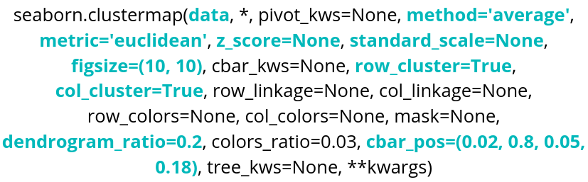
Parameter name Explanations Required type Example data Table you are planning to use DataFrame, Series, dict, array, or list of arrays data=table method SciPy method for clustering String corresponding to a SciPy method method="centroid" metric SciPy metric for clustering String corresponding to a SciPy metric metric="jaccard" z_score Variable used to standardize the data 0 for rows, 1 for columns z_score=0 standard_scale Variable used to normalize the data 0 for rows, 1 for columns standard_scale=1 row_cluster,
col_clusterVariables used to choose the clustering axes Boolean row_cluster=False figsize Variable controlling the size of the figure tuple(width,height) figsize=(4,4) dendrogram_ratio Variable controlling the size ratio of the dendrograms tuple(row ratio, column ratio) dendrogram_ratio=(0.2,0.1) cbar_pos Variable controlling the position of the color bar tuple(left,bottom,width,height) cbar_pos=(0,0.1,0.05,0.6)
Here is an example of code:
We remove the extra variable using pop() to perform the clustering. In this case, the variable is
"species", which we will reuse later.The dendrograms are the trees displayed on the sides of the clustermap that represent the different clusters formed.
Now, let's explore some of the different parameters:
row_cluster groups the rows according to their similarity in order to reveal clusters. dendrogram_ratio controls the size of the dendrograms; the first value corresponds to the one on the left and the second to the one at the top. row_colors adds a color next to the rows. Here, using the previous lines, the species corresponding to each row are displayed.
metric allows you to choose the similarity distance used, while method specifies the algorithm used to perform the clustering. Setting z_score to 1 indicates that the data is normalized across the rows. cbar_pos allows you to choose the position of the color bar. annot displays the values in each cell. figsize controls the size of the figure.
-
-