Section outline
-
-
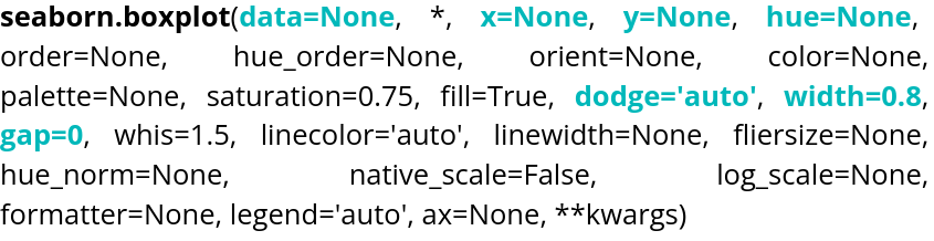
A common graphical representation of data is the box plot, which can be created using boxplot().
Parameter name Explanations Required type Example data Table you are planning to use
DataFrame, Series, dict, array, or list of arrays data=tableau x Variable of the table for the x-axis string corresponding to a variable of the table x="weight" y Variable of the table for the y-axis string corresponding to a variable of the table y=”height” hue Variable of the table to distinguish with colors string corresponding to a variable of the table hue=”age” dodge Variable allowing to choose if the content overlap Boolean dodge=False width Variable allowing to control the width of the boxes Float value width=0.5 gap Variable allowing to control the size of the gap between the "dodged" boxes Float value gap=0.1
By default, gap is set to 0. The orientation is handled automatically by Seaborn, but if the plot is two-dimensional with two numerical variables, it can be specified using orient, which can be set to"h"or"v".
The violin plot is also available through violinplot().

Parameter name Explanations Required type Example data Table you are planning to use
DataFrame, Series, dict, array, or list of arrays data=tableau x Variable of the table for the x-axis string corresponding to a variable of the table x="weight" y Variable of the table for the y-axis string corresponding to a variable of the table y=”height” hue Variable of the table to distinguish with colors string corresponding to a variable of the table hue=”age” inner Variable allowing to choose the inner representation of the violin string corresponding to a type of representation inner=”box”,inner=”quart”,inner=”point” split Variable allowing to choose if the violin will be symetric Boolean split=True width Variable allowing to control the width of the violin Float value width=0.5 dodge Variable allowing to choose if the content overlap Boolean dodge=False gap Variable allowing to control the size of the gap between the "dodged" violins Float value gap=0.1 Here is an example of code to run:
-