Since the release of Seaborn 0.12, the Seaborn Objects API has been introduced. It provides a powerful alternative to the original plotting functions. This API is inspired by ggplot2 in R.
We will use a simple example. First, we import the objects as follows:
import seaborn.objects as so
The way graphs are constructed using the objects API is specific. A single function is used to create plots:
so.Plot()
To this function, we specify the data that we are going to use:
so.Plot(tips,x=”total_bill”)
Here, tips is Seaborn's tips dataset.
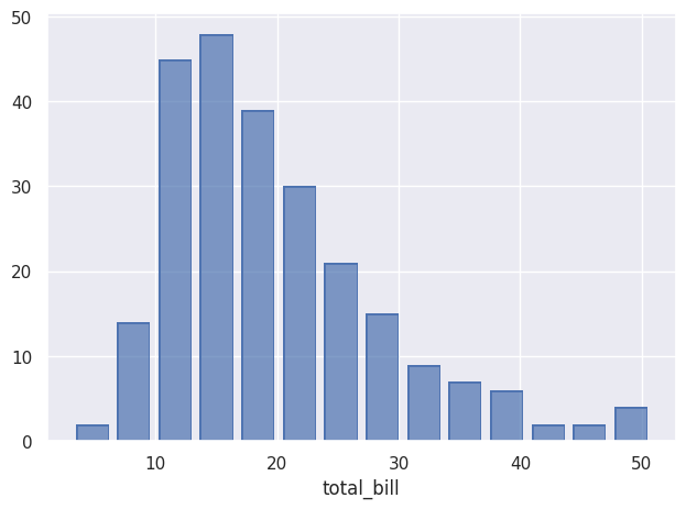
Once the data has been specified, we can decide what to do with it using add(). Here, we create a histogram:
The equivalent of the scatterplots that can be created with relplot() is the Dot() object. After the import cell, all the code will be editable.
Importation Code
← Running
Cell 2
← Running
color plays the same role as the hue parameter introduced earlier, allowing the data to be differentiated according to a variable. marker allows another variable to be used to differentiate observations using different marker types, similarly to the style parameter. facet() serves a similar purpose to row and col, allowing the data to be distributed across multiple subplots. Finally, limit allows the display to be restricted to specific ranges on the x and/or y axes.
We can also easily add a regression curve using Line() and PolyFit():
Cell 3
← Running
This same Line() can have different types, such as PolyFit(), but it can also be used as a representation of the data:
Cell 4
← Running
If no type is specified for Line(), the data points are connected with lines. An interesting feature of using pandas DataFrames, as returned by load_dataset(), is that we can use .query() to perform SQL-like queries to select specific data. Here, we select only diamonds whose cut is Ideal and whose color belongs to a specific set of colors. The chained pipe() function passes this selected DataFrame as an argument to Plot(), after which other arguments such as x, y, and linestyle can be specified. The plotted line does not correspond to each individual observation. Indeed, using Agg() allows the data to be aggregated: each price value for a given depth is aggregated and averaged in the plot. The Band() and Est() objects can be used to display uncertainty around the curves.
The Path() object is an alternative to Line(), particularly suited for representing trajectories, as it connects the data points in the order in which they are presented.
Cell 5
← Running
If we want to display the area under curves, we can use Area(). The wrap parameter of facet() allows us to choose how many plots are displayed per row.
Cell 6
← Running
We can stack the areas using Stack().
Cell 7
← Running
The Range() object allows intervals to be displayed and requires either bounds or an Est() object to calculate what should be displayed. With the latter, the mean and its confidence interval are displayed. Bounds can also be explicitly provided to define the interval to be displayed.
Cell 8
← Running
To create histograms, we use Bar() together with Hist(). We can choose the type of statistic to use. By default, "count" is used, but we can choose "density" for probability densities, "percent" for percentages, "probability" for proportions, or "frequency" for frequency.
Cell 9
← Running
Bar() can also be used to display, for example, a mean with Agg(), which allows data to be aggregated. Dodge() performs the same function as the dodge parameter in non-object-based plots.
Cell 10
← Running
To simply count occurrences, we can also use Bar(), combined with Count().
Cell 11
← Running
Seaborn objects can also be used to display percentiles with Perc(). We can choose which percentiles we want to display, and here we display them as Dot(). If no specific percentiles are selected, the default percentiles are [20, 40, 60, 80, 100].
Cell 12
← Running
We can create a graph by adding different intervals corresponding to percentiles with Range(), and use Shift() to offset them so that they remain visible. Here, scale() allows us to modify the scale of the axes, in this case the x-axis.
Cell 13
← Running
We can also normalize the values using Norm(). Here, we normalize the values relative to the minimum year, which is 1970.
Cell 14
← Running
The Dot(), Line(), Path(), and Bar() objects have variants (Dots, Lines, etc.) that are better suited to large datasets.
We can also modify the scale of the axes using scale(). Different options are available, such as "log" and "sqrt", as well as "log2" and "log10".