Section outline
-
-
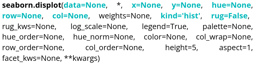
Parameter name Explanations Required type Example data Table you are planning to use
DataFrame, Series, dict, array, or list of arrays data=tableau x Variable of the table for the x-axis string corresponding to a variable of the table x="weight" y Variable of the table for the y-axis string corresponding to a variable of the table y=”height” hue Variable of the table to distinguish with colors string corresponding to a variable of the table hue=”age” row Variable of the table that will be used to make different plots, in rows string corresponding to a variable of the table row=”category” col Variable of the table that will be used to make different plots, in columns string corresponding to a variable of the table col=”job” kind Type of plot desired string, 3 choices kind=”hist”,kind=”kde” or kind=”ecdf” rug Allows to see individual values on the 2 axes Boolean rug=True Here is an editable example code that allows you to create a histogram:If no data is specified for the y-axis, the y-axis will represent the number of occurrences. If kind is not specified, a histogram is displayed by default.
The bins argument controls the number of bars. The rug parameter allows you to visualize individual observations along the axes of the plot.
We can also use Kernel Density Estimation (KDE) to estimate a distribution. Here is an example of how to use it:
If a variable is specified for y:
The last type of distribution available is the ECDF (Empirical Cumulative Distribution Function). The y parameter cannot be specified for this type of distribution, as it is univariate.
-