Section outline
-
-
Parameter name Description Format Example data The dataframe you are working on
DataFrame, Series, dict, array, or list of arrays data=table x Variable for the x-axis String corresponding to a variable x="weight" y Variable for the y-axis String corresponding to a variable y=”height” hue Allows to add a variable as different colors String corresponding to a variable hue=”age” dodge Variable allowing to choose if the contents of the graphs overlap Boolean dodge=False width Variable controlling the width of the boxes Float width=0.5 gap Variable controlling the gap between different boxes Float gap=0.1
Here is an example of code:
data = sns.load_dataset("penguins")
sns.boxplot(data=data, x="bill_length_mm", hue="island", dodge=True, width=0.5)
plt.show()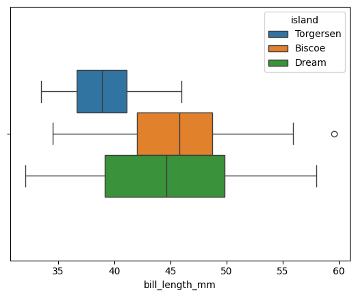
By default, gap is set to 0. The orientation is handled automatically by Seaborn, but if the plot is two-dimensional, it can be chosen manually.data = sns.load_dataset("penguins") sns.boxplot(data=data, x="bill_length_mm", hue="island", dodge=True, width=0.5, gap=0.1, log_scale=True) plt.show()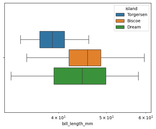
log_scale allows you to change the scale. A numeric value sets the base. If the plot is two-dimensional, two values can be provided, one for each axis.
The violin plot is also accessible via violinplot().
Parameter name Description Format Example data The dataframe you are working on
DataFrame, Series, dict, array, or list of arrays data=table x Variable for the x-axis String corresponding to a variable x="weight" y Variable for the y-axis String corresponding to a variable y=”height” hue Allows to add a variable as different colors String corresponding to a variable hue=”age” inner Variable allowing to choose the inner representation of the violin String corresponding to a representation type inner=”box”,inner=”quart”,inner=”point” split Variable allowing to choose to show 2 data groups on the same violin. Boolean split=True width Variable controlling the width of the boxes Float width=0.5 dodge Variable allowing to choose if the contents of the graphs overlap Boolean dodge=False gap Variable controlling the gap between different boxes when dodge is True Float gap=0.1 Here is an example of code:
data = sns.load_dataset("penguins")
sns.violinplot(data=data, x="bill_length_mm", hue="sex", dodge=True, linewidth=3, split=True, inner="point")
plt.show()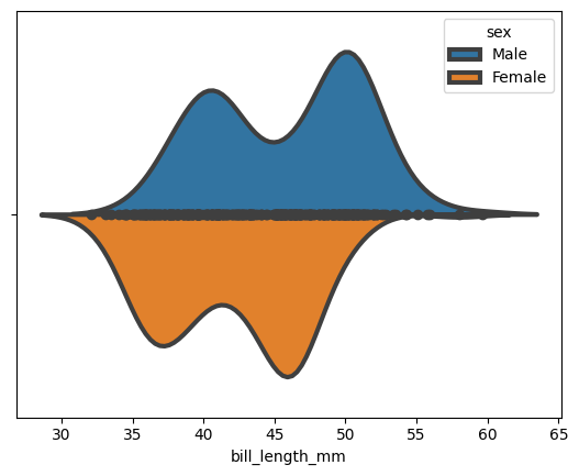
We can choose to display a small box plot within the violin plot:
data = sns.load_dataset("penguins")
sns.violinplot(data=data, x="bill_length_mm", hue="sex",dodge=True,linewidth=3, split=True, inner="box")
plt.show()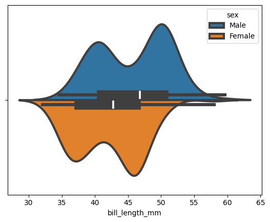
-