Section outline
-
-
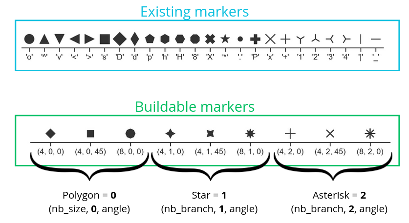
There are different visual options available in Seaborn, whether in terms of point style, line style, or colors.
Here is an example of code:
so.Plot(tips, x="total_bill", y="tip")
.add(so.Dots(marker="x"), so.Jitter(0.5))
.show()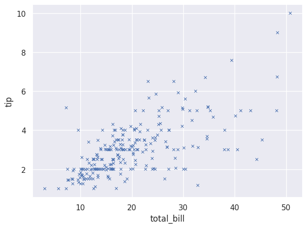
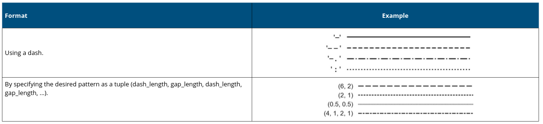
We can also change the type of lines we use:
Here is an example:
so.Plot(tips,"total_bill","tip").add(so.Lines(linestyle='--'))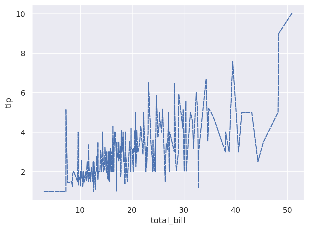
We can also choose specific colors:
Here is an example:
so.Plot(tips, "total_bill", "tip",
        color="sex", linestyle="sex")
.add(so.Lines())
.scale(color={"Male": "blue","Female": "red"},
       linestyle={"Male": "--","Female": (4,4)})
.show()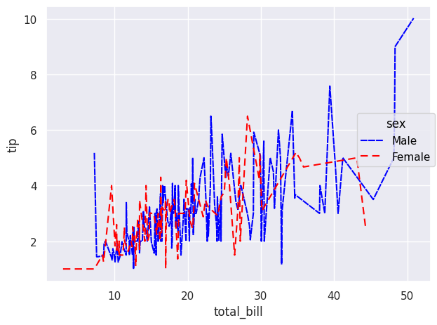
We can also define colors using color palettes:
And here is an example based on a previous code:
so.Plot(healthexp, x="Year", y="Spending_USD", color="Country")
.add(so.Lines(), so.Norm(where="x == x.min()", percent=True))
.scale(color="rocket")
.label(y="Percent change in spending from 1970 baseline")
.show()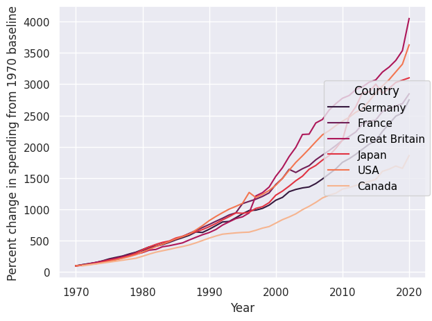
-