Section outline
-
-
The relplot() function allows you to create scatter plots and line plots.
Here is the function signature:
There is of course documentation available online, so we will only go over the most essential elements in order to display what we need as quickly as possible, namely:
Parameter name Description Format Example data The dataframe you are working on
DataFrame, Series, dict, array, or list of arrays data=table x Variable for the x-axis String corresponding to a variable x="weight" y Variable for the y-axis String corresponding to a variable y=”height” hue Allows to add a variable as different colors String corresponding to a variable hue=”age” size Allows to add a variable as the size of points String corresponding to a variable size=”money” style Allows to add a variable as the type of points String corresponding to a variable style=”sex” row Allows to create a table of plots, controling the number of rows String corresponding to a variable row=”category” col Allows to create a table of plots, controling the number of columns String corresponding to a variable col=”job” kind Type of plot you want String corresponding to a type kind=”scatter” or kind=”line” data = sns.load_dataset("penguins") sns.relplot(data=data,x="bill_length_mm",y="bill_depth_mm",hue="species",style="sex",size="body_mass_g",col="island") plt.show()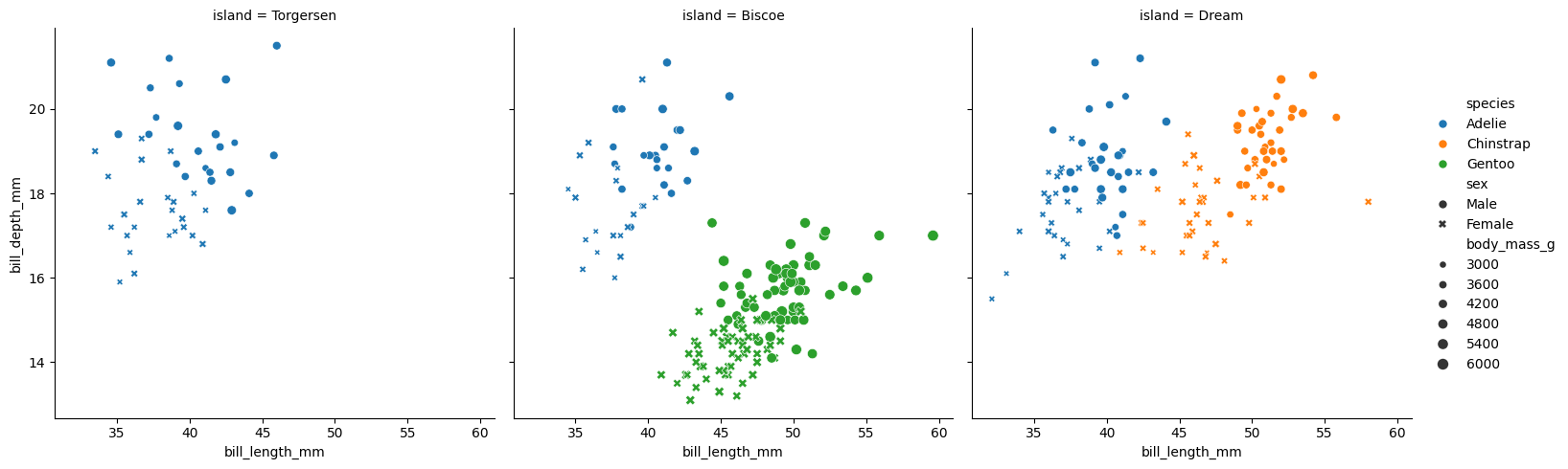
We can see that col allows us to create different plots within the same figure.
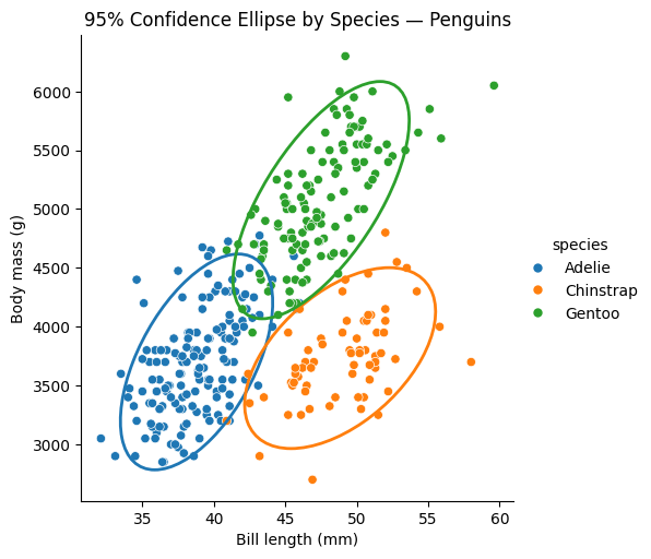
We can also add ellipses to relplot() scatter plots; to draw on them, we need to retrieve the axis (ax):
df = sns.load_dataset("penguins")
df = df[["species", "bill_length_mm", "body_mass_g"]].dropna()

g = sns.relplot(
    data=df,
    x="bill_length_mm",
    y="body_mass_g",
    hue="species",
    kind="scatter",
    height=5
)
ax = g.ax

def add_confidence_ellipse(x, y, ax, n_std=2.0, **kwargs):
    cov = np.cov(x, y)
    mean = np.mean(x), np.mean(y)
    eigvals, eigvecs = np.linalg.eigh(cov)
    order = eigvals.argsort()[::-1]
    eigvals, eigvecs = eigvals[order], eigvecs[:, order]
    angle = np.degrees(np.arctan2(*eigvecs[:, 0][::-1]))
    width, height = 2 * n_std * np.sqrt(eigvals)
    ellipse = Ellipse(
        xy=mean,
        width=width,
        height=height,
        angle=angle,
        fill=False,
        **kwargs
    )
    ax.add_patch(ellipse)

palette = sns.color_palette()

for i, species in enumerate(df["species"].unique()):
    subset = df[df["species"] == species]
    add_confidence_ellipse(
        subset["bill_length_mm"],
        subset["body_mass_g"],
        ax,
        edgecolor=palette[i],
        linewidth=2
    )

ax.set_xlabel("Bill length (mm)")
ax.set_ylabel("Body mass (g)")
ax.set_title("95% Confidence Ellipse by Species — Penguins")

plt.show()
Ellipse comes from matplotlib.patches.
And here is the result of this code:
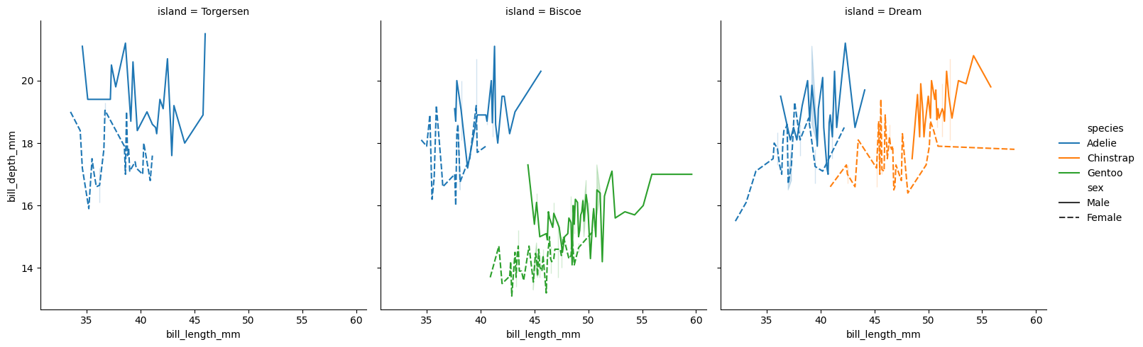
We can also display lines by changing the kind:
df = sns.load_dataset("penguins")
sns.relplot(data=df,x="bill_length_mm",y="bill_depth_mm",hue="species",style="sex",col="island",kind="line")
plt.show()
size cannot be used with line plots; here is the result of the code:
-