Section outline
-
-
-
-
Since Seaborn version 0.12, Seaborn objects have been introduced. These provide a powerful alternative to the original plotting functions. The objects are inspired by R’s ggplot2.
Let’s take a simple example. First, we import the objects as follows:
import seaborn.objects as soThe way plots are built with objects is specific. A single function is used to create plots:
so.Plot()We then specify the data we are going to use:
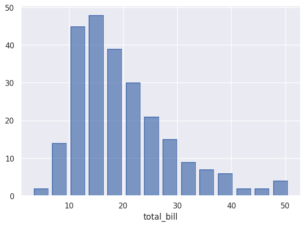
so.Plot(tips,x=”total_bill”)Here, tips is Seaborn’s built-in tips dataset.
Once the data is specified, we decide what to do with it using add(), here an histogram:
so.Plot(tips,x=”total_bill”).add(so.Bar(),so.Hist()).show()And here is the result:
-
-
-
-
-
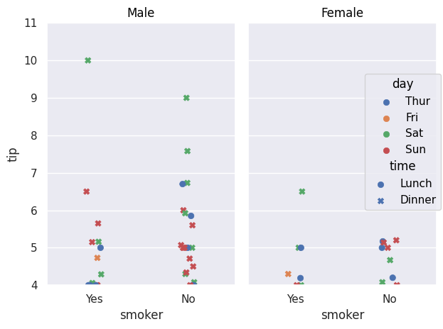
The equivalent of scatter plots that can be created with relplot() is the Dot() object.
so.Plot(tips,x="smoker",y="tip").add(so.Dot(),so.Jitter(),color="day",
marker="time").facet("sex").limit(y=(4,11)).show()
Jitter() allows you to shift points so they do not overlap, as with the jitter parameter in previous methods. color plays the same role as the previous hue parameter, allowing data to be separated according to a variable. marker allows the use of another variable that will be differentiated using different point types. facet() plays the same role as row and col.
We can also easily add a regression curve using Line() and Polyfit():
so.Plot(tips, x="total_bill", y="tip").add(so.Dot(),
color="day", marker="time").facet("sex")
.add(so.Line(), so.PolyFit(), color="time").show()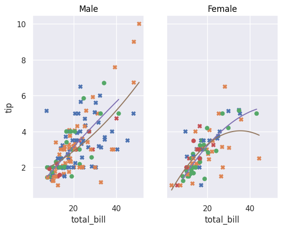
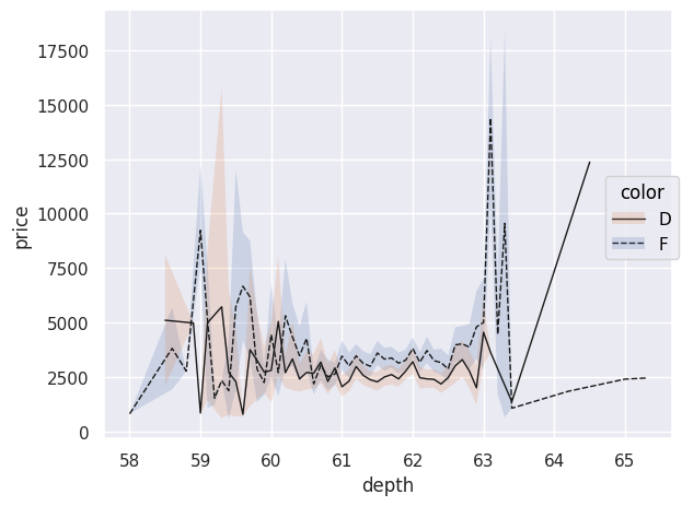
This same Line() can have different types such as Polyfit() but can also be used to represent data:
diamonds=sns.load_dataset("diamonds")
diamonds.query("cut == 'Ideal' and color != 'J' and color!= 'E' and color!='H' and color!='I' and color!='G'")
.pipe(so.Plot, "depth", "price",linestyle="color").add(so.Line(color=".1",linewidth=1),so.Agg())
.add(so.Band(), so.Est(),group="color",color="color").show()
If no specific type of Line() is specified, data points are connected with lines. An interesting aspect of using pandas DataFrames, as provided by load_dataset(), is that you can use .query() to make SQL-like queries to select specific data. Here, we only select diamonds whose "cut" is "Ideal" and with certain colors. The chained pipe() function passes this filtered DataFrame as an argument to the Plot() function; other arguments such as x, y, and linestyle can then be provided. The plotted line does not correspond to each observation point; indeed, the use of Agg() performs data aggregation: each price for a given depth is aggregated and averaged in the plot. The objects Band() and Est() allow displaying uncertainty in the curves.
The Path() object is an alternative to Line(), ideal for representing trajectories because it connects data points in the order in which they are provided.
healthexp=sns.load_dataset("healthexp")
p = so.Plot(healthexp, "Spending_USD", "Life_Expectancy", color="Country").add(so.Path()).show()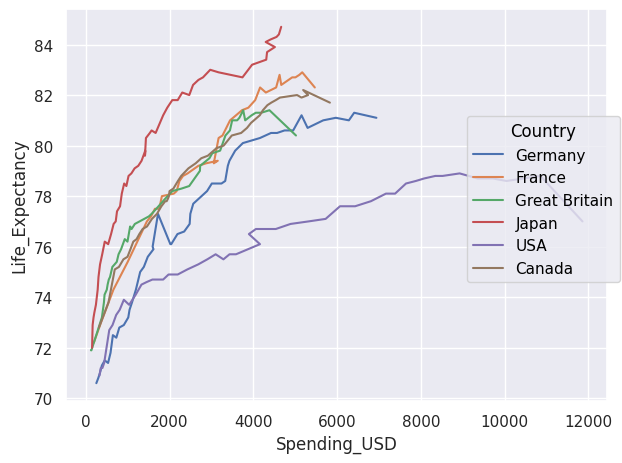
If we want to display the area under curves, we use Area(). The wrap parameter allows you to choose how many plots appear per row.
so.Plot(healthexp,"Year","Spending_USD").facet("Country",wrap=3)
.add(so.Area(),color="Country",legend=False).show()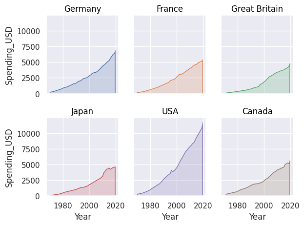
We can stack areas using Stack().
so.Plot(healthexp,"Year","Spending_USD",color="Country")
.add(so.Area(),so.Stack()).show()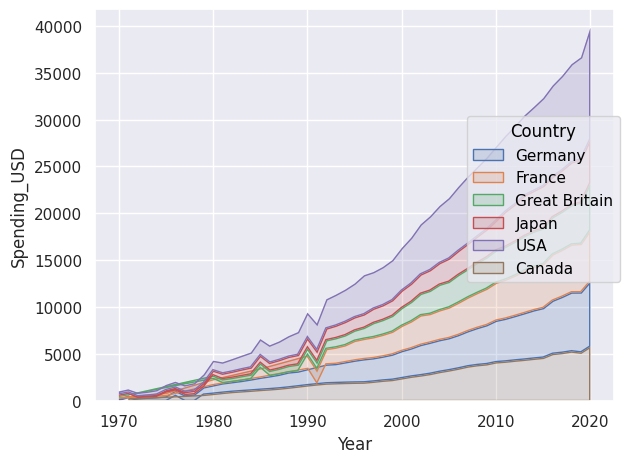
The Range() object allows displaying intervals and requires bounds or an Est() to compute what should be displayed. With the latter, we display the mean and confidence interval. We can also explicitly provide bounds to display.
df = pd.DataFrame({
    "x": [1, 2, 3],
    "y": [10, 15, 20],
    "ymin": [8, 12, 17],
    "ymax": [12, 18, 23]
})

so.Plot(df, x="x", y="y").add(so.Range(), ymin="ymin", ymax="ymax")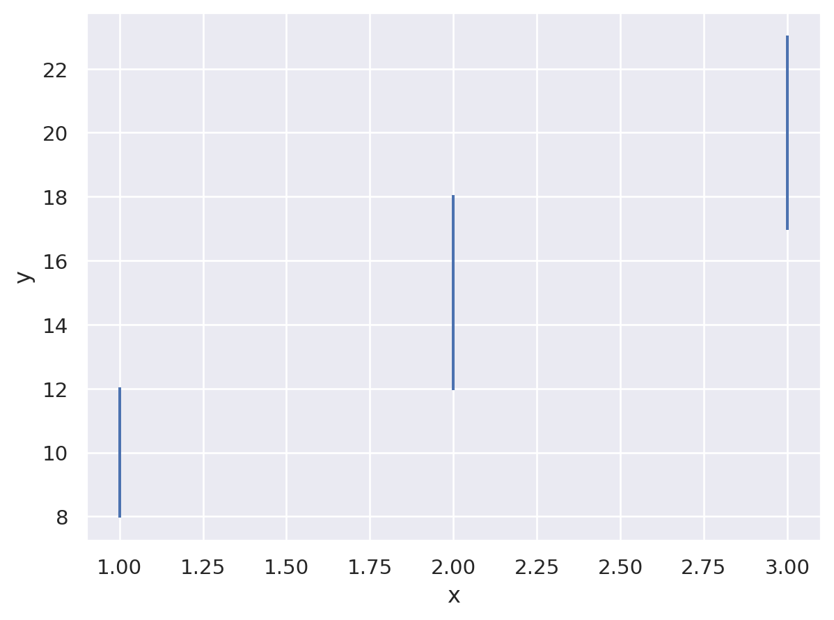
To create histograms, we use Bar() with Hist().
so.Plot(tips,x="total_bill").add(so.Bar(),so.Hist(stat="density"))
.add(so.Line(color="red"),so.KDE()).show()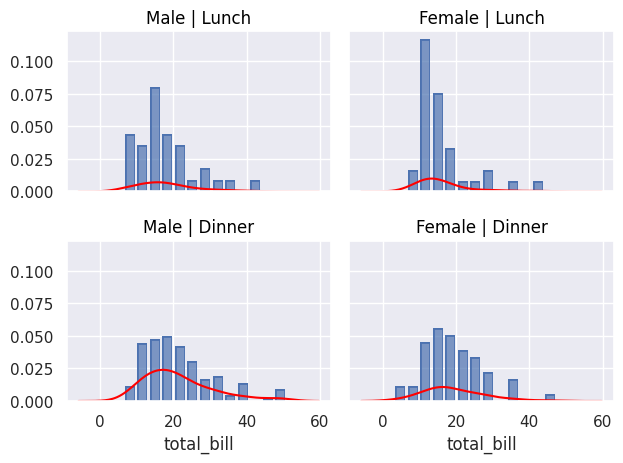
We can also use Bar() to display, for example, an average using Agg(), which performs data aggregation. Dodge() does the same as the dodge parameter in non-object-based plots.
so.Plot(tips, "total_bill", "smoker", color="sex").add(so.Bar(alpha=.5), so.Agg(), so.Dodge()).add(so.Range(), so.Est(errorbar="sd"), so.Dodge()).show()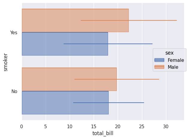
To simply count occurrences, we also use Bar() with Count().
so.Plot(tips,y="day",color="smoker").add(so.Bar(),so.Count(),so.Stack()).show()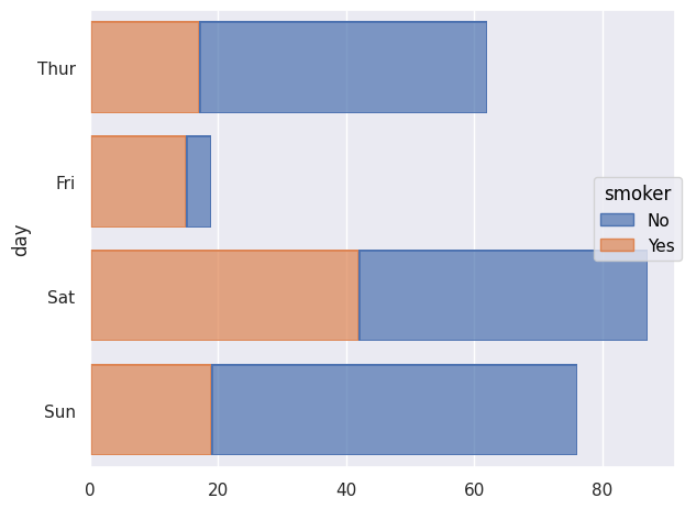
We can also use Seaborn objects to display percentiles using Perc(). We can choose which percentiles to display; here they are shown as Dot(). If nothing specific is chosen, the percentiles [20,40,60,80,100] are displayed.
so.Plot(tips,"smoker","total_bill").add(so.Dot(marker="s"),so.Perc([10,50,90])).show()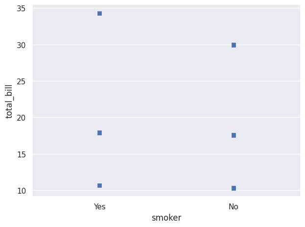
We can create a plot where different percentile intervals are added using Range(), shifted with Shift() so they are visible. Here, scale() is used to change the axis scale, here the x-axis.
so.Plot(diamonds, "price", "cut").add(so.Dots(pointsize=1, alpha=.2), so.Jitter(.3)).add(so.Range(color="k"), so.Perc([0, 25]), so.Shift(y=.2)).add(so.Range(color="k"), so.Perc([75, 100]), so.Shift(y=.2)).scale(x="log").show()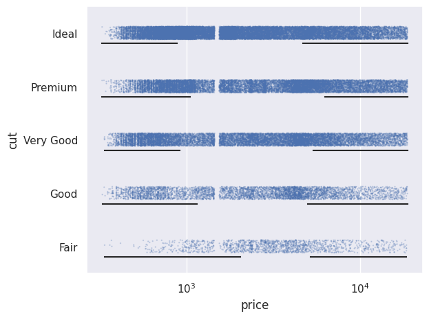
We can also normalize values using Norm(). Here we normalize relative to the minimum year, i.e. 1970.
so.Plot(healthexp, x="Year", y="Spending_USD", color="Country")
.add(so.Lines(), so.Norm(where="x == x.min()",percent=True))
.show()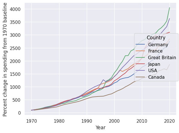
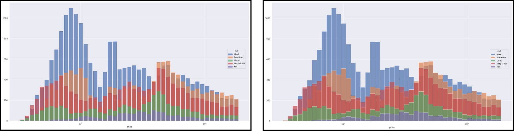
The objects Dot(), Line(), Path() and Bar() have variants (Dots, Lines, etc.) better suited for large datasets. Here is an example with Bar() on the left and Bars() on the right.
We can also modify axis scales using scale().
so.Plot(tips,x="total_bill",y="tip")
.add(so.Dots(),so.Jitter(0.5),color="day",marker="time")
.scale(x=so.Continuous(trans="log"),y=so.Continuous(trans="sqrt"))
.show()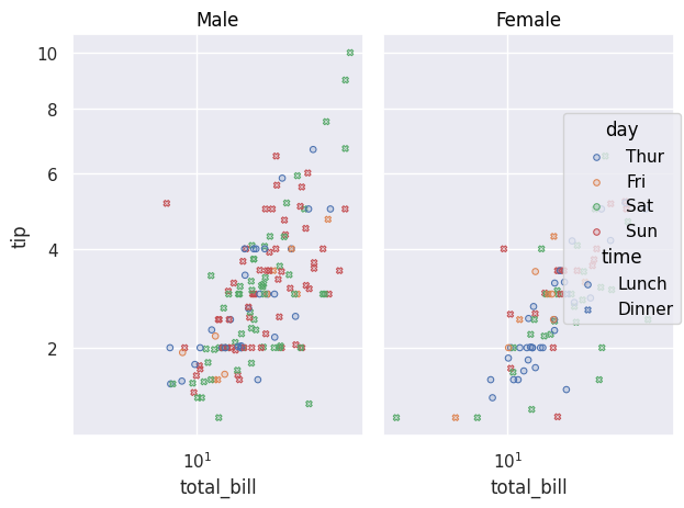
-
-
-