Section outline
-
-
Seaborn provides several functions that allow you to plot multiple different graphs at the same time.
Let’s start with jointplot(). With it, you can display a two-dimensional plot along with the corresponding one-dimensional plots on the axes. Here is an example using the penguins dataset:
g=sns.jointplot(data=data, x="bill_length_mm", y="bill_depth_mm",
 kind="kde", hue="species")

for species in data["species"].unique():
    subset = data[data["species"] == species]
    g.ax_joint.scatter(
        subset["bill_length_mm"],
        subset["bill_depth_mm"],
        s=subset["body_mass_g"]/500,
        label=species,
        alpha=0.7)
The for loop in the code allows the points to be displayed in addition to the plots. It is Matplotlib code.
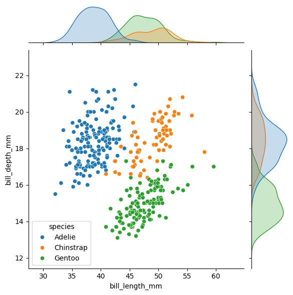
An alternative that allows for more control and customization is JointGrid(). In particular, you can use different types of plots for the bivariate and univariate parts.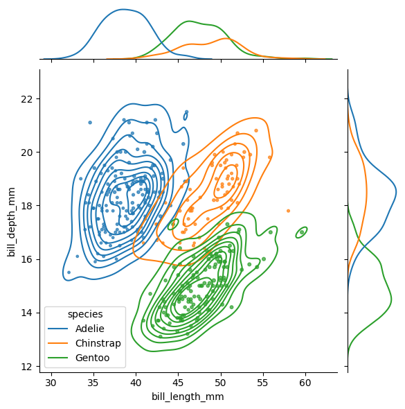
g5 = sns.JointGrid(data=data, x="bill_length_mm", y="bill_depth_mm",
 hue="species")
g5.plot_joint(sns.scatterplot)
g5.plot_marginals(sns.kdeplot, fill=True)
plot_joint() controls the type of the bivariate plot, and plot_marginals() controls the univariate ones.
Another type of visualization is pairplot(). It allows you to display, within a single figure, plots for all pairwise combinations of variables around the diagonal, along with a distribution for each variable on the diagonal.
sns.pairplot(data=data, hue="species")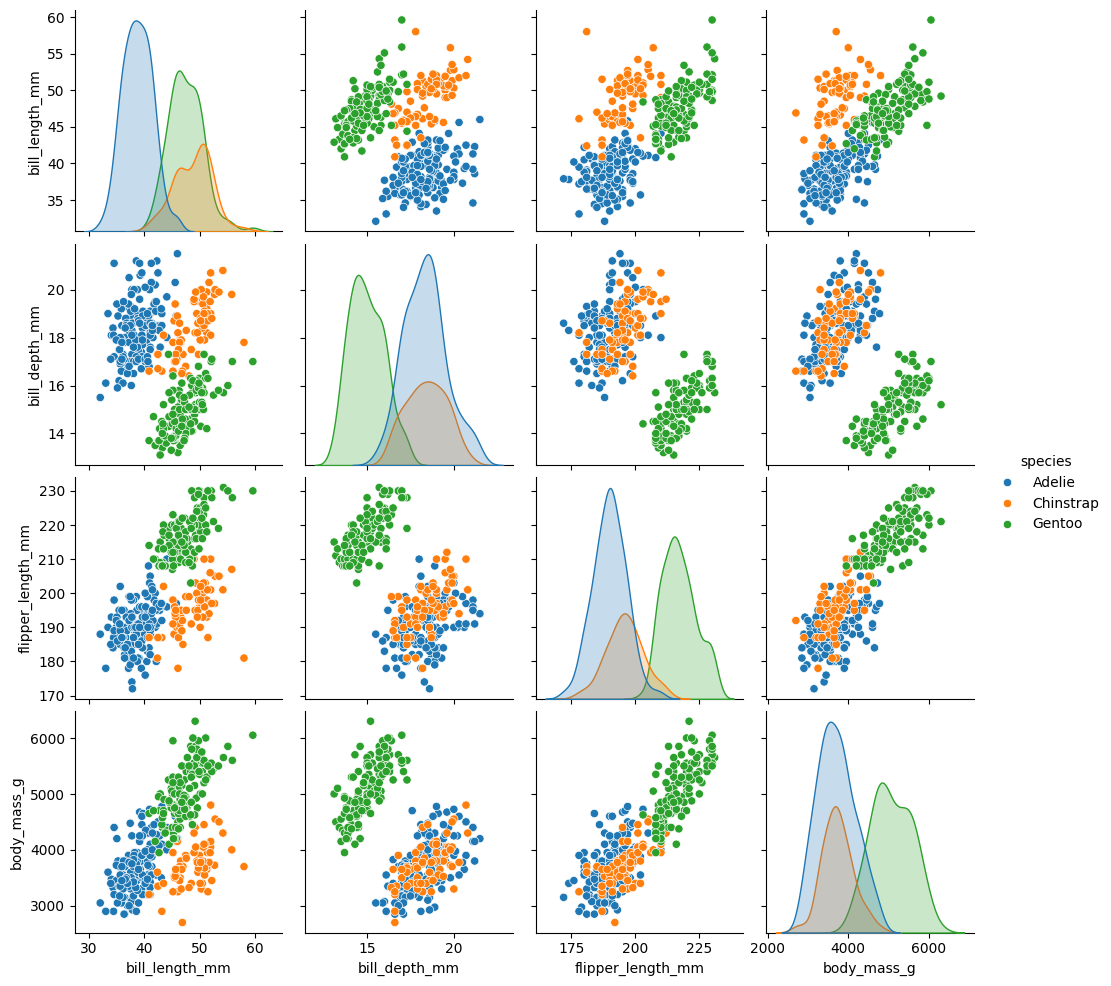
You can modify the type of plot on the diagonal and off-diagonal using diag_kind for the diagonal and kind for the others. diag_kind can only take hist or kde as values.
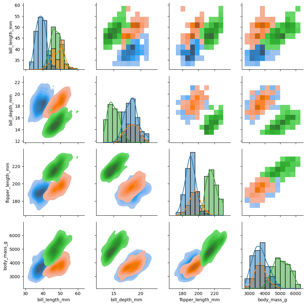
As with jointplot(), pairplot() has a complementary tool that allows for more control and customization: PairGrid(). With it, you can, for example, choose different types of plots above and below the diagonal.
g7 = sns.PairGrid(data, hue="species") g7.map_upper(sns.histplot) g7.map_lower(sns.kdeplot, fill=True) g7.map_diag(sns.histplot, kde=True)map_upper(), map_lower(), and map_diag() allow you to control the different types of plots in the figure.
Finally, we have FacetGrid(), which does not automatically create different plots within a figure but allows you to do so manually using col and row, and to modify plots individually within the figure. It is a function that is closer to Matplotlib:
tips = sns.load_dataset("tips")
g = sns.FacetGrid(tips,col="sex",row="time",margin_titles=True,
     despine=False,sharex=False)
g.figure.subplots_adjust(wspace=0.05, hspace=0.2)
for (row_val, col_val), ax in g.axes_dict.items():
     subset = tips[(tips["time"] == row_val) & (tips["sex"] == col_val)]
     if row_val == "Lunch" and col_val == "Female":
         subset = subset[subset["tip"] > 2]
         sns.scatterplot(data=subset,x="total_bill",y="tip",hue="smoker",
         ax=ax)
         ax.set_facecolor(".3")
         ax.set_xlim(0,20)
         ax.set_ylim(0,30)
         ax.set_xticks([0, 5, 15])
         ax.set_xlabel("tip>2")
         ax.grid(True, color="gray", linestyle="-", linewidth=0.5)
         ax.spines["top"].set_color("red")
         ax.spines["right"].set_color("red")
         ax.spines["bottom"].set_color("red")
         ax.spines["left"].set_color("red")
         ax.tick_params(axis="x", colors="blue")
     else:
         ax.set_facecolor((0, 0, 0, 0))
         sns.scatterplot(data=subset,x="total_bill",y="tip",hue="smoker",
         ax=ax)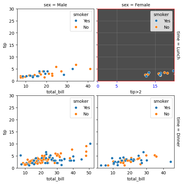
-