Section outline
-
-
-
-
The relplot() function allows you to create scatter plots and line plots.
Here is the function signature:
There is of course documentation available online, so we will only go over the most essential elements in order to display what we need as quickly as possible, namely:
Parameter name Description Format Example data The dataframe you are working on
DataFrame, Series, dict, array, or list of arrays data=table x Variable for the x-axis String corresponding to a variable x="weight" y Variable for the y-axis String corresponding to a variable y=”height” hue Allows to add a variable as different colors String corresponding to a variable hue=”age” size Allows to add a variable as the size of points String corresponding to a variable size=”money” style Allows to add a variable as the type of points String corresponding to a variable style=”sex” row Allows to create a table of plots, controling the number of rows String corresponding to a variable row=”category” col Allows to create a table of plots, controling the number of columns String corresponding to a variable col=”job” kind Type of plot you want String corresponding to a type kind=”scatter” or kind=”line” data = sns.load_dataset("penguins") sns.relplot(data=data,x="bill_length_mm",y="bill_depth_mm",hue="species",style="sex",size="body_mass_g",col="island") plt.show()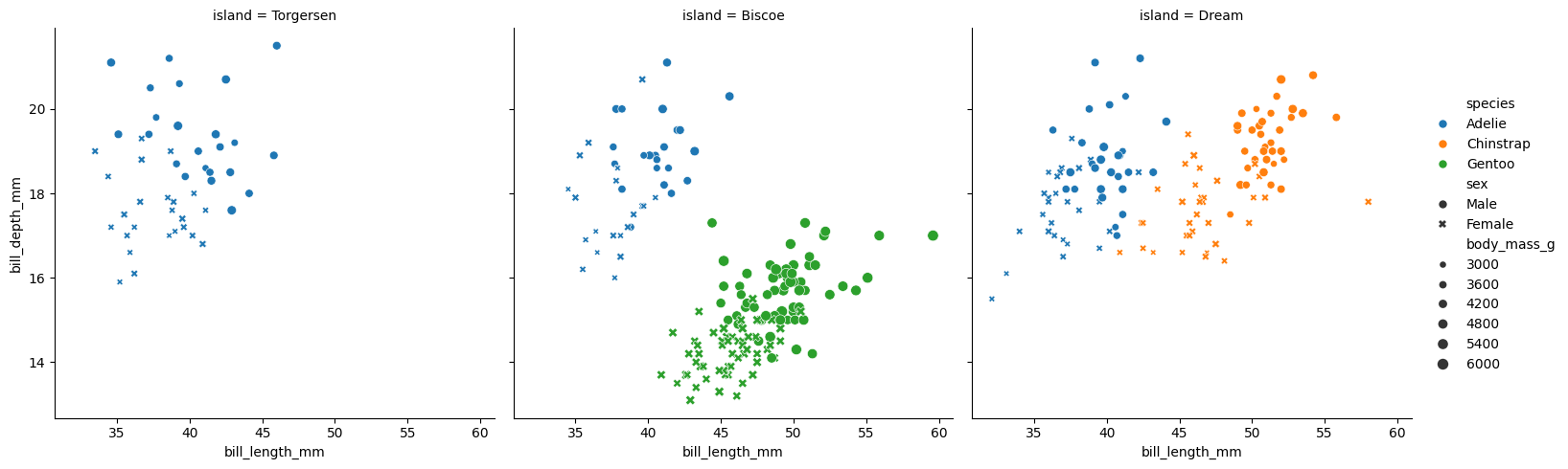
We can see that col allows us to create different plots within the same figure.
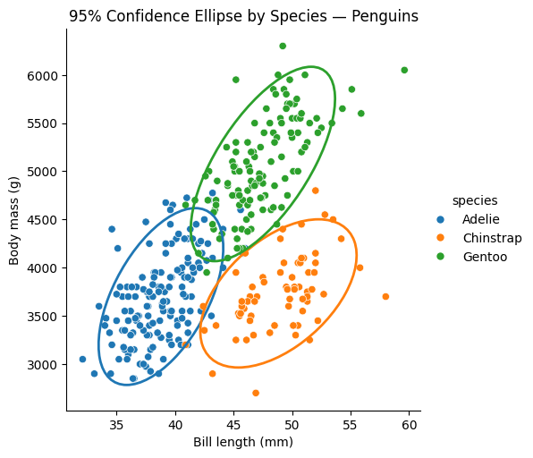
We can also add ellipses to relplot() scatter plots; to draw on them, we need to retrieve the axis (ax):
df = sns.load_dataset("penguins")
df = df[["species", "bill_length_mm", "body_mass_g"]].dropna()

g = sns.relplot(
    data=df,
    x="bill_length_mm",
    y="body_mass_g",
    hue="species",
    kind="scatter",
    height=5
)
ax = g.ax

def add_confidence_ellipse(x, y, ax, n_std=2.0, **kwargs):
    cov = np.cov(x, y)
    mean = np.mean(x), np.mean(y)
    eigvals, eigvecs = np.linalg.eigh(cov)
    order = eigvals.argsort()[::-1]
    eigvals, eigvecs = eigvals[order], eigvecs[:, order]
    angle = np.degrees(np.arctan2(*eigvecs[:, 0][::-1]))
    width, height = 2 * n_std * np.sqrt(eigvals)
    ellipse = Ellipse(
        xy=mean,
        width=width,
        height=height,
        angle=angle,
        fill=False,
        **kwargs
    )
    ax.add_patch(ellipse)

palette = sns.color_palette()

for i, species in enumerate(df["species"].unique()):
    subset = df[df["species"] == species]
    add_confidence_ellipse(
        subset["bill_length_mm"],
        subset["body_mass_g"],
        ax,
        edgecolor=palette[i],
        linewidth=2
    )

ax.set_xlabel("Bill length (mm)")
ax.set_ylabel("Body mass (g)")
ax.set_title("95% Confidence Ellipse by Species — Penguins")

plt.show()
Ellipse comes from matplotlib.patches.
And here is the result of this code:
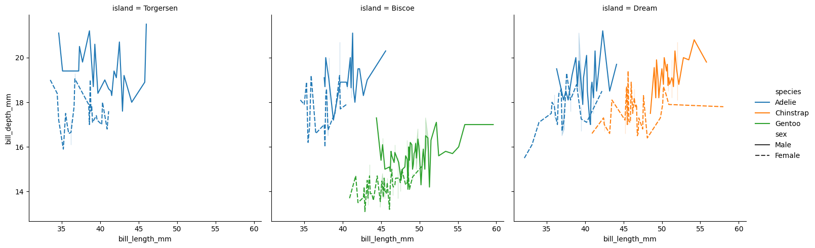
We can also display lines by changing the kind:
df = sns.load_dataset("penguins")
sns.relplot(data=df,x="bill_length_mm",y="bill_depth_mm",hue="species",style="sex",col="island",kind="line")
plt.show()
size cannot be used with line plots; here is the result of the code:
-
-
-
-
-
The displot() function allows you to display different types of distributions.
Parameter name Description Format Example data The dataframe you are working on
DataFrame, Series, dict, array, or list of arrays data=table x Variable for the x-axis String corresponding to a variable x="weight" y Variable for the y-axis String corresponding to a variable y=”height” hue Allows to add a variable as different colors String corresponding to a variable hue=”age” row Allows to create a table of plots, controling the number of rows String corresponding to a variable row=”category” col Allows to create a table of plots, controling the number of columns String corresponding to a variable col=”job” kind Type of plot you want String corresponding to a type kind=”hist”,kind=”kde” ou kind=”ecdf” rug Allows to see individual data points on the axes Boolean rug=True Here is an example code that creates a histogram:data = sns.load_dataset("penguins") sns.displot(data=data, x="bill_length_mm", rug=True, hue="sex", bins=20) plt.show()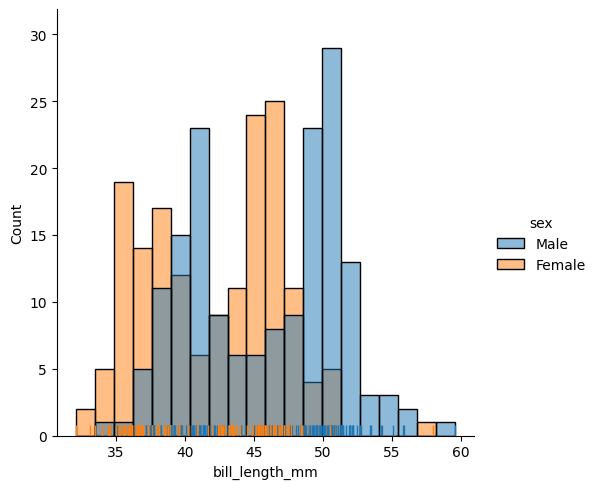
If you don’t specify the data for the y-axis, it will represent the number of occurrences, and if you don’t specify the kind, it defaults to a histogram. The bins argument controls the number of bars.
We also have access to kernel density estimation (KDE) to estimate a distribution. Here is an example of how to use it:
data = sns.load_dataset("penguins")
sns.displot(data=data,x="bill_length_mm", rug=True, hue="sex", kind="kde")
plt.show()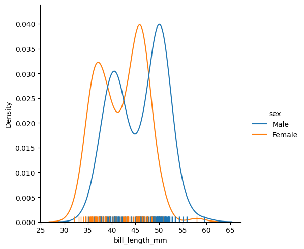
If you specify a variable for the y-axis:
data = sns.load_dataset("penguins")
sns.displot(data=data,x="bill_length_mm", y="bill_depth_mm", rug=True, hue="sex", kind="kde")
plt.show()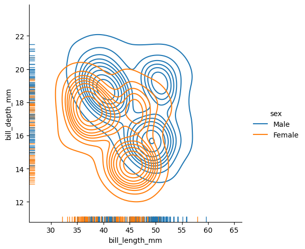
The rug parameter allows you to display individual observations along the axes of the plot.
The last type of distribution available is the ECDF (empirical cumulative distribution function). You cannot specify a y variable for this distribution since it is univariate.
data = sns.load_dataset("penguins") sns.displot(data=data, x="body_mass_g", rug=True, hue="sex", kind="ecdf", row="species", col="sex", height=5) plt.show()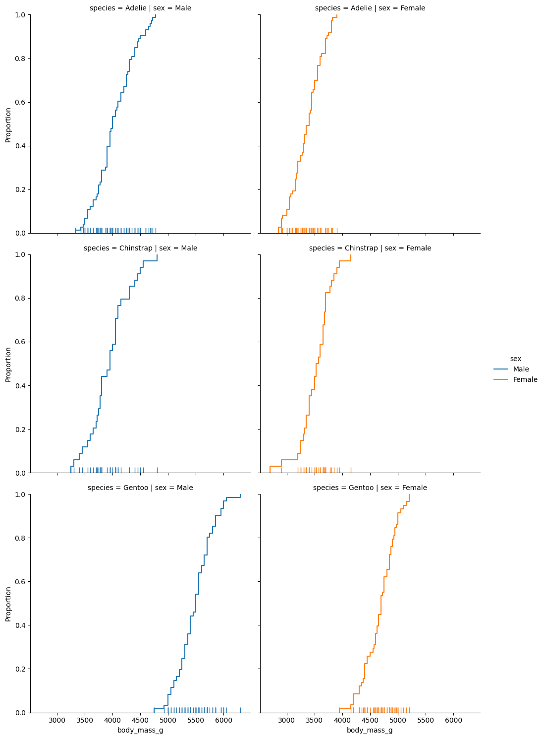 The row parameter allows you to display additional plots based on another variable in the dataset. The height parameter controls the height of the plots.
-
-
-
-
-
Parameter name Description Format Example data The dataframe you are working on
DataFrame, Series, dict, array, or list of arrays data=table x Variable for the x-axis String corresponding to a variable x="weight" y Variable for the y-axis String corresponding to a variable y=”height” hue Allows to add a variable as different colors String corresponding to a variable hue=”age” dodge Variable allowing to choose if the contents of the graphs overlap Boolean dodge=False width Variable controlling the width of the boxes Float width=0.5 gap Variable controlling the gap between different boxes Float gap=0.1
Here is an example of code:
data = sns.load_dataset("penguins")
sns.boxplot(data=data, x="bill_length_mm", hue="island", dodge=True, width=0.5)
plt.show()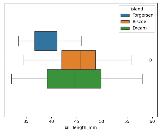
By default, gap is set to 0. The orientation is handled automatically by Seaborn, but if the plot is two-dimensional, it can be chosen manually.data = sns.load_dataset("penguins") sns.boxplot(data=data, x="bill_length_mm", hue="island", dodge=True, width=0.5, gap=0.1, log_scale=True) plt.show()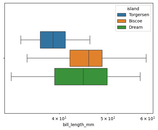
log_scale allows you to change the scale. A numeric value sets the base. If the plot is two-dimensional, two values can be provided, one for each axis.
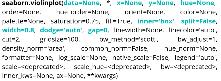
The violin plot is also accessible via violinplot().
Parameter name Description Format Example data The dataframe you are working on
DataFrame, Series, dict, array, or list of arrays data=table x Variable for the x-axis String corresponding to a variable x="weight" y Variable for the y-axis String corresponding to a variable y=”height” hue Allows to add a variable as different colors String corresponding to a variable hue=”age” inner Variable allowing to choose the inner representation of the violin String corresponding to a representation type inner=”box”,inner=”quart”,inner=”point” split Variable allowing to choose to show 2 data groups on the same violin. Boolean split=True width Variable controlling the width of the boxes Float width=0.5 dodge Variable allowing to choose if the contents of the graphs overlap Boolean dodge=False gap Variable controlling the gap between different boxes when dodge is True Float gap=0.1 Here is an example of code:
data = sns.load_dataset("penguins")
sns.violinplot(data=data, x="bill_length_mm", hue="sex", dodge=True, linewidth=3, split=True, inner="point")
plt.show()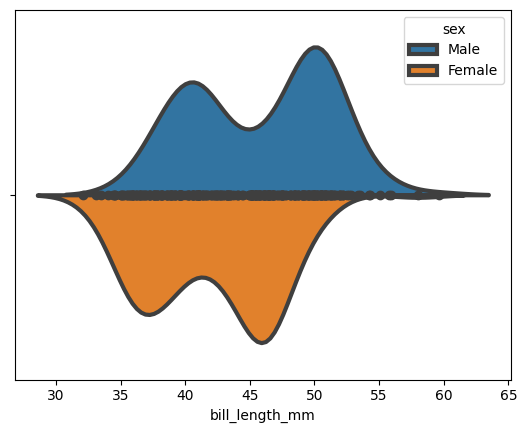
We can choose to display a small box plot within the violin plot:
data = sns.load_dataset("penguins")
sns.violinplot(data=data, x="bill_length_mm", hue="sex",dodge=True,linewidth=3, split=True, inner="box")
plt.show()
-
-
-
-
-
If you want to perform linear regressions, Seaborn provides a dedicated function: regplot().
Parameter name Description Format Example data The dataframe you are working on
DataFrame, Series, dict, array, or list of arrays data=table x Variable for the x-axis String corresponding to a variable x="weight" y Variable for the y-axis String corresponding to a variable y=”height” ci Variable allowing to control the confidence interval displayed Integer between 1 and 100 ci=99 nboot Variable indicating the number of bootstrap resampling that will be done Integer nboot=100 seed Variable to indicate a seed for the resampling, allows reproductibility Integer seed=42 logistic Variable allowing to do a logistic regression Boolean logistic=True lowess Variable allowing to do a lowess regression Boolean lowess=True robust Variable allowing to do a robust regression Boolean robust=True regplot() also allows you to display the confidence interval, which is set to 95% by default.
Here is an example of code:
sns.regplot(data=data, x="bill_length_mm",y="bill_depth_mm", ci=70)
plt.show()
We can change the type by selecting a parameter, for example the lowess parameter, and setting it to True: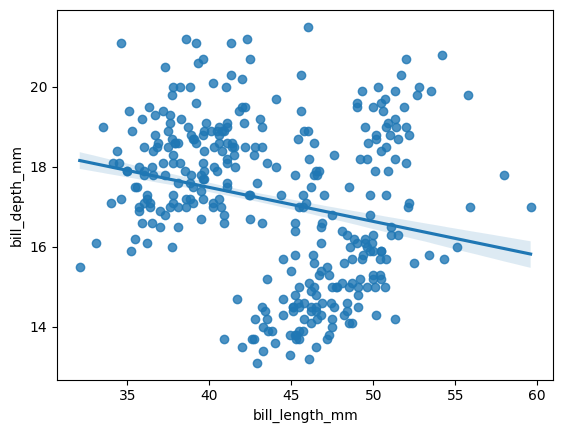
sns.regplot(data=data, x="bill_length_mm", y="bill_depth_mm",
 ci=99, lowess=True)
plt.show()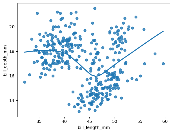
The confidence interval is not displayed when using LOWESS.
Another option is lmplot(), which is more suitable for performing regressions across multiple plots.
Parameter name Description Format Example data The dataframe you are working on
DataFrame, Series, dict, array, or list of arrays data=table x Variable for the x-axis String corresponding to a variable x="weight" y Variable for the y-axis String corresponding to a variable y=”height” hue Allows to add a variable as different colors String corresponding to a variable hue=”age” row Allows to create a table of plots, controling the number of rows String corresponding to a variable row=”category” col Allows to create a table of plots, controling the number of columns String corresponding to a variable col=”job” ci Variable allowing to control the confidence interval displayed Integer between 1 and 100 ci=99 nboot Variable indicating the number of bootstrap resampling that will be done Integer nboot=100 lowess Variable allowing to do a lowess regression Boolean lowess=True Here is an example of code:
sns.lmplot(data=data, x="bill_length_mm", y="bill_depth_mm", ci=95, hue="island", robust=True, col="sex")
plt.show()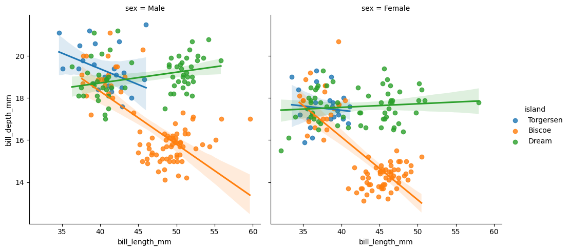
Robust and logistic regressions are also available, as with regplot(). nboot and seed are also available.
-
-
-
-
-
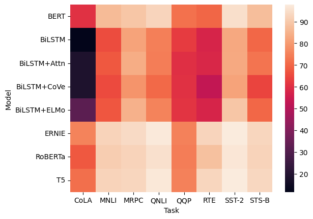
Seaborn also allows you to create heatmaps using heatmap().
Parameter name Description Format Example data The dataframe you are working on
DataFrame, Series, dict, array, or list of arrays data=table cmap String corresponding to a palette or a Seaborn color_palette cmap=”viridis” or cmap = sns.color_palette("light:blue", as_cmap=True) annot Boolean annot=True, default is False vmin Minimum value that will be taken into account for the colormap. Float vmin=30.6 vmax Maximum value that will be taken into account for the colormap. Float vmax=42 linecolor String corresponding to a color linecolor=”blue” linewidths Float linewidths=0.2 or linewidths=10 mask Parameter used to control the range of values taken into account in the heatmap. Boolean list, same format as data mask=table_mask
Here is an example of code:
glue=sns.load_dataset("glue").pivot(index="Model",columns="Task",values="Score")
sns.heatmap(glue)
We use pivot to format the data in the order we want:
- index defines the variable for the y-axis (ordinates).
- columns defines the variable for the x-axis (abscissas).
- values must be a numerical variable, and it is what the heatmap will use for coloring.
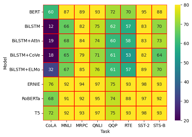
sns.heatmap(glue,cmap="viridis",annot=True,vmin=20,vmax=80,linecolor="red",linewidths=0.1)With the vmin and vmax parameters, we can choose the range of values over which the heatmap will apply, and we also have visual options such as linecolor and linewidths for the lines between the cells.
If we need clustering in the heatmap, we can use Seaborn’s clustermap(). One thing to know is that this function requires SciPy, so it must be installed in the environment you are working in. If you are using Colab, this will not be necessary, as you can import it directly.
Parameter name Description Format Example data The dataframe you are working on
DataFrame, Series, dict, array, or list of arrays data=table method SciPy method used to perform clustering. String corresponding to a SciPy method. method=’centroid’ metric SciPy metric used for clustering. String corresponding to a SciPy metric. metric=’jaccard’ z_score Parameter used to center and standardize the data. z_score=0 standard_scale Parameter used to normalize the data, without deviation. standard_scale=1 row_cluster,
col_cluster
Boolean row_cluster=False figsize Parameter controlling the size of the figure. tuple (width, height) figsize=(4,4) dendrogram_ratio tuple (row ratio, column ratio) dendrogram_ratio=(0.2,0.1) cbar_pos tuple (left, bottom, width, height) cbar_pos=(0,0.1,0.05,0.6)
iris = sns.load_dataset("iris")
species = iris.pop("species")
sns.clustermap(iris)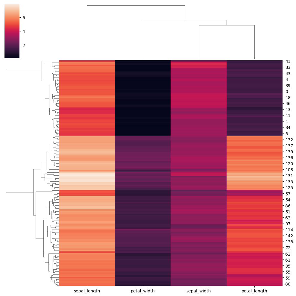
Now let’s explore different parameters:
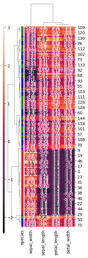
lut = dict(zip(species.unique(), "rbg"))
row_colors = species.map(lut)
sns.clustermap(iris,row_cluster=True,dendrogram_ratio=(0.2,0.1),row_colors=row_colors,method="weighted",metric="correlation",z_score=1,annot=True,figsize=(3,9),cbar_pos=(0,0.1,0.02,0.8))
row_cluster allows grouping rows based on their similarity in order to reveal clusters. dendrogram_ratio controls the size of the dendrograms: the first value corresponds to the one on the left, and the second to the one at the top. row_colors allows adding a color indicator next to the rows. In this case, using the previous settings, the species of each row is shown. metric defines the similarity (distance) measure used, and method specifies the algorithm used for clustering. Setting z_score to 1 normalizes the data across rows. cbar_pos allows setting the position of the color bar.
-
-